Showing posts with label abstract. Show all posts

Monday, 11 January 2016

30 in 30 - "The Plan"

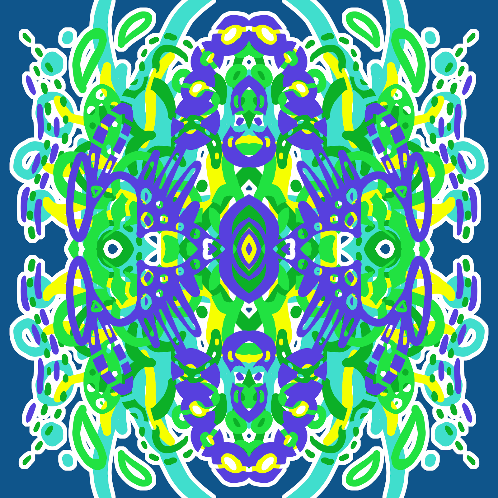
I felt like playing with my Wacom tablet again today, so I made a digital abstract painting. I like the colours in this one. The blue/indigo shades layer nicely together. Maybe I should create digital mockups of my abstract paintings more often. I feel like it comes out more naturally when I'm not worried about 'wasting paint'.

Day 11

"The Plan", Digital, January 2016

Sunday, 10 January 2016

30 in 30 - "Springtime" Repeating Design and Handbag Concept

One of the hardest things I find about creating something is creating with a purpose in mind when you start. It's easy to tinker about until you create something you really like through experimentation. it becomes difficult when you want to create a product, have many copies manufactured and shipped at great upfront expense, and just hope people like it enough to buy them. If you think you're self conscious about your art, try backing it enough to spend several thousand dollars on the hope that someone will like it. It's scary stuff.

This is my latest creation. I've been trying to come up with some more designs to print on handbags. I think this one would make a nice bag, so I hope people agree with me.

Day 10

"Springtime", Digital Art, January 2016

I made a mockup of what it would look like repeating on a bag.


Let me know in the comments section what you think of this bag design. Your feedback will help me to decide which bags to have made. Thanks for looking!

Saturday, 9 January 2016

Color Throwdown 374 - "Tints and Tones" Abstract Digital Art

I really like the inspiration picture for this week's Color Throwdown challenge. I think the dining set is from Anthropology or somewhere like that? I seem to remember seeing it before.


I decided to make an abstract this time, just doodling in Photoshop. I used a few tints and tones of the orange and turquoise colour, to mix it up a bit. I quite like how that turned out. This also counts as Day 9 of the 30 Paintings in 30 Days challenge. Still not sure if I should stick to abstracts for the whole month, but at this point I haven't felt like doing much else. Follow the inspiration where it strikes, I guess.

Day 9

"Tints and Tones", Digital, January 2016

Thursday, 7 January 2016

30 in 30 - "Summer Nest" Oil Pastel Abstracts

More artworks for the 30 Paintings in 30 Days Challenge. Still experimenting with oil pastels here. I find that I work very differently creating abstracts with oil pastels as opposed to paints. I don't try to cover the surface quite so much, which allows some of the original colour of the paper to show though. 

I'm using a keyboard with an attached mouseball at the moment, which makes it hard to edit these images. I'll crop and reupload them later when I have a proper mouse. For now, I just wanted to make sure they were posted before I went to bed.

Day 6

"Summer Nest", Oil Pastel, January 2016


Day 7


Day 8


Tuesday, 5 January 2016

30 in 30 - "Sunrise" and "Celebrate"

Apparently some people are having trouble uploading their links to the 30 Paintings in 30 Days blog. I wrote a how to article explaining How to Join a Link Party to Increase Your Blog Traffic a while ago now. Looking back, I'm not sure if it goes into enough detail, but hopefully it will help someone.

I like how brightly coloured today's entry is. I'm enjoying the opaque oil pastels on the brightly coloured papers. I should try doing some layering next and see how that turns out.

Day 4

"Sunrise", January 2016, Oil Pastel

Day 5

;
'"Celebrate", Oil Pastel, January 2016

Saturday, 2 January 2016

30 in 30 - "Time Capsule", "Olives" and "Hieroglyphs" Abstract Art

First post of 2016. Happy New Year, everyone! Looking back on the past year, I've accomplished a couple of things that I wanted to get done. I've been blogging for about two years now, on and off, and I've started to get more serious with it late last year. I wanted to average at least one blog post per week, which I've done. This year, I'd like to do more in the way of tutorials and posts that people might learn something from. 

But first, I'd like to try the 30 Paintings in 30 Days challenge again. It's been a while since the last time I tried, but it would be good to get back into the habit of seriously trying to create something new every day. I know I can do it, I've done it before, I just have to make sure I do it now.

I've been a bit undecided about what I want to create for this month's challenge, so I might mix it up a bit as I go, and experiment with different abstracts, portraits, whatever strikes my fancy. We'll see what happens.

Day 1

"Time Capsule", January 2016, Acrylic Paint

Day 2

"Olives", January 2016, Oil Pastel


Day 3

"Hieroglyphs", January 2016, Oil Pastel

I'll probably put a couple of artworks on each blog post if I don't have much to say about them. That makes it easier than making a blog post every single day."

Sunday, 8 November 2015

"Autumn Flame" - Pals Paper Arts 274

Some days, whatever you try to create just doesn't work out. I knew I wanted to spend today creating new art because I had a decent chunk of time to do so. I tried about three different things before coming to the conclusion that being creative just wasn't happening for me today, so I decided to work on some more businessy things instead.


But still, I knew I wanted to create something nice today, because I knew I'd be a bit sad about it if I didn't make anything nice. This was my third attempt at the Pals Paper Arts colour palette for this week, and I'm glad I persevered, because I'm pretty happy with it. 

"Autumn Flame Repeating", November 2015, 15x15 Inch

I don't know how I keep end up doing the colour palette challenges with chocolate brown in them, and skipping the ones that don't. It's a weird trend for someone who isn't that fond of brown. But it works quite nicely with the coral and yellow colours, so I can't complain. 


Thanks for taking the time to look at my art. Don't forget to add Renee Dillon Art on Facebook and Instagram to keep track of my latest work.

Arabesque Trellis Preview

I'm currently getting back into the swing of things after a pretty solid month of work at my day job. It's nice to have the time and energy to be creative again. Sometimes you just need a bit of time to play. Unfortunately, I wasn't quite thinking when I created this pattern, because I managed to save this small preview sized image that I'm currently using as a desktop background, but not the original sized artwork that I was actually going to make something with. So that's frustrating. Luckily, it didn't come out quite how I wanted, so I was going to have another crack at it anyway. 

For now, here's the small version to show you.

"Arabesque Trellis", November 2015

I'm not even sure if that's clear enough for you to see, but it's the best I can do. Let this be a reminder to keep track of what you've saved when you're closing files. I have a bad habit of getting distracted mid project, and going to work on another image, so I often have about ten tabs open at the end of a session. Don't do this. Save what you need as you go.

But also, don't worry too much if you lose things. It happens. There will always be something else to draw tomorrow.

Monday, 26 October 2015

"Lady Beatle" - Digital Mandala

I adore the colours in this one. Shades of aqua/blue and pink together make me so happy. I thought this one looked like a scarab in feminine colours, so I called it "Lady Beatle".

"Lady Beatle", Digital, September 2015

Wednesday, 21 October 2015

"Circuit" - Digital Mandala

Tinkering with computers must have put me in the mood to draw something that looks like a piece of computer hardware. It must have been an unconscious connection, because I don't think I would have even noticed if it wasn't for the green and gold colours that look like part of a motherboard.

"Circuit", Digital Mandala, October 2015

Tuesday, 20 October 2015

"Naughts and Crosses" - Digital Mandala

Another stripe-style mandala. I like the happy white cloud shape in the background.

"Naughts and Crosses", Digital, September 2015

"Naughts and Crosses Tiling", Digital, September 2015

Monday, 19 October 2015

"Cross Stripe" - Digital Mandala

Another mandala from back in September. I think I need to keep better track of which pictures I've uploaded and which ones are already on the blog. When everything is all together in one folder it's easy to lose things.

"Cross Stripe", Digital, September 2015

This one becomes a patterned stripe in tiling form, because the pattern doesn't touch the sides. So that's a kind of cool thing to do.

"Cross Stripe Tiling", Digital, September 2015

Saturday, 17 October 2015

"Frogger" - Digital Repeating Pattern

Lots of blue and green shades in this one. The aqua dots make me think of the little sticky toes on a frog, so I've called it "Frogger". The more I look at it the more eyes I see.

"Frogger", Digital, September 2015

Thursday, 15 October 2015

"Mermaid" - Digital Mandala

I loved this one so much I made it my new Facebook cover image. In hindsight, I wasn't that happy with the 'temporary' art I'd put there but forgotten to replace. So glad I finally realised that I had nice new art to replace it with. The brighter colours really freshen the page up.

"Mermaid", Digital Mandala, October 2015

Tuesday, 13 October 2015

"Dream Catcher" - Digital Mandala

This is the other artwork I'm considering for my first printed handbags. I love the aqua and blue tones in this one, but I still think I'm edging just slightly towards the first. This one makes me think of feathered Native American headdresses or some kind of Mardi Gras decoration. 

"Dream Catcher", Digital Mandala, September 2015


I would have liked to create something new today, but I just spent the morning trying to fix some problems with my wacom tablet. It seems I need to spend an hour fixing things every time I try to create something. But I'm pretty sure I'm close to having all the kinks in my workflow ironed out.

Thursday, 8 October 2015

"Disco Ant" - Digital Mandala

Another of my mandalas, completed back in September. I have to start posting these as I do them, rather than thinking of something clever to say, or they'll never get posted.

"Disco Ant", September 2015


Monday, 28 September 2015

"Space Highway" - Digital Mandala

Talking about your own art can be one of the most difficult parts of the process. I've always wanted to share what I'm working on with others, but coming up with a spiel to go along with it tends to trip me up. It feels strange to just post an image with no accompanying explanation, but I find there isn't much to say. I'm not a very conceptual artist, so even coming up with a title can be tricky. And while I like to be a positive and uplifting person, talking about how much you like your own art leaves you balancing the fine line between obnoxiously self-confident and annoyingly self-deprecating. It can be hard to convey the fact that you're happy with your work (sometimes more than others) but you see there are things you'd like to improve upon and areas you'd like to explore. Except in that one exact sentence, and that hardly lends itself to a second blog post.

My favourite art bloggers seem to have galleries that they exhibit in, art-related businesses that they run, sponsors to talk about, or ongoing personal projects to discuss. It's easy to compare yourself to someone who has spent many years cultivating their online presence and find yourself falling short. But it's important to look at the things they do well and create those traits in yourself. 

I wonder that I don't have any projects to work on, but I don't start them. I get distracted easily by other ideas, which makes it very difficult to work in series or finish a long term project. But I intend to change that. For the last few months, I've been planning to have some things manufactured with my designs and sell them online. In a manner that is most unlike me, I've made concrete steps towards my goal, rather than planning things in the abstract until I lose interest. I know I have to see actual results, such as sales of products that I've created, so that I know the effort is worthwhile and I should keep going. The next step is to decide which artwork should adorn my first item and have the sample made up and sent to me.

I've been working on several abstract designs that I can have printed on handbags. So far, this is my favourite. Whether this ends up being my first printed design or not, I still haven't decided. But it's nice to be making art that I can feel proud of again.

"Space Highway", Digital, September 2015


Sunday, 3 May 2015

Vortex - Acrylic Paint and Ink Portrait by Renee Dillon

The unexpected arrival of a friend in town made this post a little late, but I'm still hoping to get something up every day in May.


I was going to go with a green background for this one, then get a bit distracted by other colours that were still on my palette and then this happened. Next time I'll experiment with how a single colour background looks. I still think I prefer the person staying in one colour.

Sunday, 29 March 2015

Valencia - Symmetrical Tiling Digital Abstract in Pink and White

Uploading images is not nearly as fun as creating art, but I'm starting to streamline the process a bit. Here's another of my new digital artworks. I named it Valencia because the little sections in the middle reminded me of orange segments. 

"Valencia", Digital Symmetrical Abstract


I really love the look of one colour on white. It's very simple, yet works so well. I'd love to have this pattern printed at Spoonflower and make it into a shirt or dress at some point. If you're interested in purchasing prints or items with my art on them, you can check out my Fine Art America or Society 6 stores. Fine Art America is also great if you want to see my art in more of a gallery format, rather than in blog posts. Thanks for looking. :)

Wednesday, 25 March 2015

Kurt - Digital Symmetrical Tiling Abstract

Lately I've been trying to upload some of my art on a stock photo website. I've been contemplating getting into digital downloads again, like the cat silhouettes I used to sell on Etsy. Actually I've been contemplating a lot of directions I could take my art, and it has left me at a bit of a standstill. I don't know the best way to tackle it, so I overthink everything and don't get much done. I know that I could spend many hours on a project, only to realize that my time would have been better spent another way.

This morning I spent about an hour uploading files to Society 6. I like the amount of control they give you, but wish the process could be more streamlined. There should be an option to upload the largest size file, have them automatically resized by their system to fit the dimensions of each product, and manually fix whichever products you might want to turn out differently. Maybe it's more complicated than that, I don't know. 

This is my latest addition to my Society 6 store, Kurt. I designed it in a few colourways, but only the teal and purple version at the top is in the store. I don't know that I have the patience for any more today. It's just a shame that things that shouldn't take so long take many hours away from actually being able to create new things. 


Check out my store on Society 6 if you want to see this design (and a few of my others) on mugs, tote bags and other products.

nRelate Posts Only