Showing posts with label mixed media. Show all posts

Saturday, 2 January 2016

30 in 30 - "Time Capsule", "Olives" and "Hieroglyphs" Abstract Art

First post of 2016. Happy New Year, everyone! Looking back on the past year, I've accomplished a couple of things that I wanted to get done. I've been blogging for about two years now, on and off, and I've started to get more serious with it late last year. I wanted to average at least one blog post per week, which I've done. This year, I'd like to do more in the way of tutorials and posts that people might learn something from. 

But first, I'd like to try the 30 Paintings in 30 Days challenge again. It's been a while since the last time I tried, but it would be good to get back into the habit of seriously trying to create something new every day. I know I can do it, I've done it before, I just have to make sure I do it now.

I've been a bit undecided about what I want to create for this month's challenge, so I might mix it up a bit as I go, and experiment with different abstracts, portraits, whatever strikes my fancy. We'll see what happens.

Day 1

"Time Capsule", January 2016, Acrylic Paint

Day 2

"Olives", January 2016, Oil Pastel


Day 3

"Hieroglyphs", January 2016, Oil Pastel

I'll probably put a couple of artworks on each blog post if I don't have much to say about them. That makes it easier than making a blog post every single day."

Sunday, 3 May 2015

Vortex - Acrylic Paint and Ink Portrait by Renee Dillon

The unexpected arrival of a friend in town made this post a little late, but I'm still hoping to get something up every day in May.


I was going to go with a green background for this one, then get a bit distracted by other colours that were still on my palette and then this happened. Next time I'll experiment with how a single colour background looks. I still think I prefer the person staying in one colour.

Monday, 2 March 2015

Fergie - Mixed Media Portrait by Renee Dillon

I feel like I've found a solution to the problems I was having with finding a substrate for my art. I thought I'd get a nice pad of watercolour paper to try out. Instead I found a Canson Acrylic Pad at Lincraft. It has an almost canvasy texture to it, but it's still thin enough to use on my lightbox. It doesn't crease and the paint sits nicely on the surface.


This was my first experiment using the new paper and I'm loving it so far. It feels a bit more classy than regular cartridge paper, so I wouldn't feel bad selling an artwork made on it, but it's not so expensive that I'm too afraid to use it.


PRODUCTS USED:
(Not this paper pad, but something very like this, various brands of paint)

Tuesday, 17 February 2015

"Amy" - Symmetrical Tiling Abstract in Acrylic Paint

So I've been keeping at my plan to create for an hour a day during February. I'm already a little bit ahead for tomorrow. I find it interesting that sketching and lineart seems to go by so fast, I finish a drawing and I've hardly used up any of my time, yet when I sit down to paint it feels like the time flies by. Maybe I'm focusing harder when I have the paints out because painting is still so strange and different for me. I've been drawing for years, but I'm still quite new to paints, in a way.


Blogger is refusing to justify my text for some reason. It's annoying me to no end.

Paintings in the Works: "Sargent Peanutbutter" the Horse, "Cookie" the Pug, "Fizzy" the Pug, "Lesley" the Cow, Other Misc Art

Sunday, 1 February 2015

30 Paintings in 30 Days - Final Thoughts

So, Leslie Saeta's 30 Paintings in 30 Days challenge is finally over for the month of January. I might not have completed 30 finished paintings, as was my original plan, but I did make 22 blog posts, as well as some other art experiments or unfinished pieces that didn't get posted at all. So overall, I'm happy with my effort, and want to compound upon it in future. 

My next rather ambitious goal is to see if I can work on art for at least one hour per day for the whole month of February. That's 28 hours total. I wonder how much I'll actually be able to create in that time. More than if I wasn't pushing myself, that's for sure. My main aim is to set aside a period of time in which I'm not allowed to get distracted by other things. Hopefully it will also encourage me to work faster so I have something to blog about at the end of each session, rather than sit there pondering colour palettes or mediums.

Here are some of the things I didn't get around to posting this month.


Digital Layout of Abstract

Digital Layout of Abstract

Work in Progress of Flower Painting, Need to Add Detail with Pens, Pencils etc.

You might see more of these in future. Or I might get distracted and work on other things. But I thought they belonged here as part of the record of the month anyway.

Saturday, 17 January 2015

30 Paintings in 30 Days - Day 15 - J K Rowling Final Mixed Media Portrait

I'm guessing this is the second last picture of J K Rowling. All I have left to do is touch up the lineart that has been hidden under layers of paint, then she's done. I'll probably edit this post with the finished artwork rather than make a new post, because six posts of J K Rowling is probably at least 4 posts too many. 


I've painted this portrait on the back of a piece of 12 x 12 scrapbooking paper I bought from GOLO when they were closing down. I wanted to see if scrapbooking paper made a nice surface for painting on, and so far I'm pleased. It held up nicely to layers without too much creasing or buckling, which is good. It's kind of a cardstock thickness. I'll have to check what gsm is written on the paper pad. I might keep an eye out for seasonal paper pads when they're on sale, because I predict I'll be using them for painting again in future. Maybe after next Christmas I'll have finished with the paper I have and it will be the perfect time to buy a new one.


Here's the final piece with reinked lineart, unless I choose to go back and figure out where the rest of the lines in the hair go, Which I might, but that's a job for later. Tomorrow, a new piece of art.

Wednesday, 14 January 2015

30 Paintings in 30 Days - Day 14 - J K Rowling Work in Progress 2

So now J K Rowling has dark hair and looks nothing like J K  Rowling. Admittedly, it wasn't a great likeness to begin with, but now she looks like an entirely different woman. I wanted to cover the splatters with my house paint sample - a British Paints sample pot in the colour Blue Gum Park - then go over that with a lighter blue that would be more similar in value to her actual blonde air. I'm getting into the process of layering different colours to add depth to the final painting. It will be easier once I figure out how all of my different brands and types of acrylic paint react to each other.


PRODUCTS USED (Assorted brands of paints):

30 Paintings in 30 Days - Day 13 - J K Rowling Work in Progress

I've started adding some colour to the J K Rowling sketch I painted yesterday. The splattery texture in the hair is there to cover up some lines I didn't want to keep. I added more spatters to make it look like a uniform pattern rather than one random splodge where the line was. It will mostly be covered up when I add the additional layers of hair colour anyway, but I wanted to make sure the original line wouldn't be visible.


I know I'm technically not posting a new artwork for the 30 Paintings in 30 Days challenge today, but I've decided that I'd rather do part of a larger artwork each day than pump out 30 smaller, less polished artworks for the month. As long as I'm continuing to draw, paint and experiment with different ideas and techniques, and as long as I have something to post each day, I feel like I've accomplished what I intended to anyway.

PRODUCTS USED (Assorted brands of paints):


EDIT: Added these two posts into one because there wasn't that much progress between the two images.


Next step in the J K Rowling portrait. I've added some more shading and highlights to the face to make it look a bit less flat. I've used yellow, orange, red, magenta and blue to create the kind of purpley hue I've ended up with, which I quite like. The hair spatters are looking quite messy now, so hopefully they'll be covered up in the next step.


I'm probably going a bit overboard with the amount of blog posts for this one piece of artwork, but I like documenting the process for future reference. Maybe one day I'll look back at this and think "Good grief, why did I do it like that?" Only time will tell.

PRODUCTS USED (Assorted brands of paints):
 

Friday, 9 January 2015

30 Paintings in 30 Days - Day 9 - Beach

So here's a drawing of a beach in coloured pencil and ink. The colour of the sky and water seem to be too close together in this picture. The sky is more purple in the original. Every day, I have less and less to say about these pictures. Daily posting is hard.


30 Paintings in 30 Days - Day 8 - Elephant

This time, I painted a little elephant. The background was originally orange, then painted over with green. It does provide an interesting depth of colour. I'll have to try that again. Maybe next time I'll underpaint a whole image, then paint over it again in contrasting colours.


Wednesday, 7 January 2015

30 Paintings in 30 Days - Day 7 - Two Pears with Dots

Experimented a little with using strongly contrasting colours to make shading and texture with this one. The white of the polka dots was done with a sakura gel pen, but I think I might go over it with white paint as well. Next time I try some colourful pears I might try adding even more colours. It's hard to experiment with things that need a lot of layers to dry when you want to upload something every day.


30 Paintings in 30 Days - Day 6 - Half Pear

I'm finding that even redrawing the lineart that has been painted over it makes such a difference in how much the image pops. Also found out today what a difference it makes to paint an underpainting in a completely different colour to the one you want showing on top. That will be coming up in a couple of days. Todays pear was an experiment in painting a thicker layer rather than being so sparing, and I'm pretty happy. The colours aren't quite what I originally envisioned, but I quite like this one as it is.


I almost missed the deadline for submitting this one to the 30 in 30 linkup on Leslie Saeta's blog. It was sitting in my email ready to upload, but I didn't realise I hadn't submitted it. 

Monday, 15 December 2014

Jennifer Aniston - Mixed Media Portrait by Renee Dillon


This artwork was a pretty big experiment for me. Even though the image itself is quite simple and straight forward, it was an experiment in applying finished artwork on paper to a canvas. I figure if I can glue a finished artwork on paper to a canvas or other kind of panel and make it look finished even without a frame, I can be more free to work on different sized artwork and experiment without worrying about finding frames to fit. Canvases seem to come in a wider variety of sizes than standard photo frames do, and I can trim a piece of art to fit the canvas as well.

I'd like to be able to complete a few pieces of art before picking my favourites to go on canvases without having to have a huge room full of canvas art that I like enough not to paint over, but not quite enough to hang. This way, I can store the others as flat paper without taking up as much space.

Something I've learned from this experiment - Paint on thicker paper. The paper I painted this image on was quite thin and wrinkled as it dried. I flattened it out fairly well by placing a couple of heavy books on top of it, but it seemed to wrinkle more when I glued it down with matt medium. Air bubbles getting stuck between the paper and the canvas also seemed to be a problem, which I tried to smooth out a bit until I ripped the paper. Thicker paper definitely would have held up better to the moisture. 

The picture above is how it looked before I glued it to the canvas. I might post an update picture of it on the canvas after I've trimmed off the edges. Still need to buy a blade or sharp knife in order to do that.

Sunday, 14 December 2014

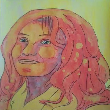
Adele - Mixed Media Portrait in Yellow, Red and Teal by Renee Dillon

This portrait of Adele is one of my favourite recent artworks. I've really been enjoying getting used to working with paint and mixed media. This one uses black coloured pencil for the lineart. I like the kind of rustic, expressive look the pencil lines give that I find hard to do with pen. Maybe I should work on making my pen lines more expressive in future. I also love the colour scheme in this one. The contrast between the bright reds and oranges and the cool blues and greens is nice. I'll have to use them together again.


I had a go at using various layers of shadow to the face. Still not perfect, but I'm pleased with it. 

Karl Stefanovic - Mixed Media Portrait in Blue and Orange by Renee Dillon

This is the first of a series of portraits that I've decided to work on (the last few blog posts were kind of practice faces or experiments that lead to the idea). I'm always looking for new faces to draw. One of my favourite places to look for faces is television. You can capture a screenshot at a particular moment and get close up shots of faces of different shapes and sizes, at different angles, showing different emotions. TV and movies can be a much better place to find drawing references than using posed photos as they offer more variety and movement. Also, once you have the basic gist of the face, you can add or remove details, change the hairstyle, create patterns and use colour combinations that didn't appear in the original image.


Over the next year I'd like to create a collection of portraits of famous people and characters, as well as unknown people that I find interesting reference images of. I'd like to get better at creating a likeness between the original image and the artwork, as well as experimenting with colour and texture. I've already been putting together a list of people that might be interesting to draw, as well as keeping an eye out for news stories about celebrities. Celebrity news isn't something I follow personally, but if people are interested in and talking about particular people it might increase the chance of people liking and sharing my art on social media. 

Of course, that means I have to get into the habit of creating art quickly and posting it while the person in question is still in the spotlight. Or alternatively, creating art of celebrities and resharing it when they come into the spotlight again. I'm not sure if this is even a remotely useful way to garner an audience - people who are reading celebrity news might not be all that interested in portraiture - but if I'm going to be drawing anyone it might as well be them. 

Goals for this project:
- Draw more men. Most of my portraits so far have been of women.
- Draw more older people. Draw wrinkles. They're interesting.
- Draw faces I find attractive and faces I don't find attractive.
- Draw the same person multiple times, changing things to make a completely different artwork.
- Pay attention while watching tv shows and movies in case a good opportunity for a screenshot arises.
- Don't be afraid to admit who the person is supposed to look like, even if it isn't a good likeness. 


I chose to draw TV host Karl Stefanovic because he was in the news recently. Apparently, he did an experiment where he wore the same suit every day for a year in order to prove that his fashion choices weren't under as much scrutiny as his female counterparts in the industry, As he predicted, nobody seemed to notice or care that he wore the same suit every day. I thought that it was an amusing way to make a point, so I decided to paint him first. He looks a little smurf-like in blue, but I wanted to make him blue to match the blue suit.

Thursday, 4 December 2014

Patterned Face Experiment 1 and 2

This portrait was an attempt at adding more pattern and colour to my faces. I've seen a few different artists that draw or paint portraits over a patterned background, with the background patterns peaking through the shading and highlights of the face. I like this effect, but it's trickier than I had imagined to pull it off. This first attempt contains too much doodling and the colours are too dark. The lineart gets lost in the chaos and isn't very clear. I think this technique requires larger shapes and brighter colours to work, or at least for the doodles to be obscured under layers of transparent paint.


Since I had liked the sketch so much, I decided not to give up on this particular face. I drew the lineart again on a seperate piece of paper. I like to trace over my original sketch on a new piece of paper to prevent lead pencil smudges on the finished piece and so I still have the original in case I mess up and want to start again (as I did in this case).


This time I went for a cleaner, more simple colouring. The hair is acrylic paint and the face is coloured pencil. I like how this one turned out much better. The background is plain white but I might try cutting out my faces and glueing them on patterned backgrounds in future. This gives me the freedom to splash about creating the background, without worrying about being able to get the face how I want it. When both pieces are created seperately and joined at the end, I can create each without the stress that I might ruin one or the other.

It was interesting to see how two very different looking pieces came from the same lineart. I should try this again in future to see how different techniques and colourways can affect the outcome.

Thursday, 27 November 2014

Back Home - Coloured Pencil Sulfur Crested Cockatoo Art by Renee Dillon

Looks like the month of November has been creeping away from my. Or sprinting. Whichever. I've had a bit of a break from artmaking and art blogging again, as I spent a month on an overseas trip. I travelled to England, Scotland, Venice and Greece before coming back to Australia. I intended to pick up where I left off with the blog when I got back, but you'd be surprised how much there is to do when you come back after a whole month away. And, apart from that, being sick and jetlagged and not wanting to do any of it.

Now that I've recovered and gotten myself back into something of a routine, I'm ready to dust off the old blog again. This particular blog has been going for almost a year now. I haven't quite kept up with the four blog posts a month that I intended at the beginning, but there is still time to catch up. I think I need to write another twenty blog posts before the end of December to meet that goal, which is still very achievable. 

I'd also like to start doing Youtube videos, detailing how I make my art. It's the sort of thing I'd like to watch other people do more, but I've been finding it hard to find videos of people just splashing around with paint. Art journalling Youtube channels seem to be the closest to the things I've been looking for, particularly videos by artists like The Frugal Crafter, Julie Fei-Fan Balzer and The Artistic Pagan. Hoping to find some other Youtube artists to add to my list of inspiration. I haven't tried putting together a how to or technique video yet, but that's something I'd like to have a go at too.

Despite the fact that I haven't been blogging in the two weeks since I've been back, I have made a little bit of art. I've also started to clean up my art space to make it easier to film. Little things like having a clear space will make it so much easier to just switch on a camera and start making art when I feel like it, rather than being daunted by the thought of setting everything up and putting it off.

"Rainbow Sulfur Crested Cockatoo", Coloured Pencil, Crayon and Ink


This is something I drew not long after leaving home. It's a sulfur crested cockatoo with a colourful rainbow crest. I tried to make sure I bought all the art supplies I could possibly need with me, but at the end of the day I didn't use much. Could have got by with a mechanical pencil, eraser, black pen and about ten coloured pencils. Instead I had a big pencil case of pencils, brush tip markers, twistable crayons and other nonsense I just didn't need. You really notice that you have things you don't need when you're lugging them through airports and around the streets with you. I'll try to travel light in future. You can do a lot of things with very minimal supplies if you put your mind to it. There's no point saying "I might need those other things later" if you aren't going to sit down and find the time to make yourself use them.

Products Used:

nRelate Posts Only