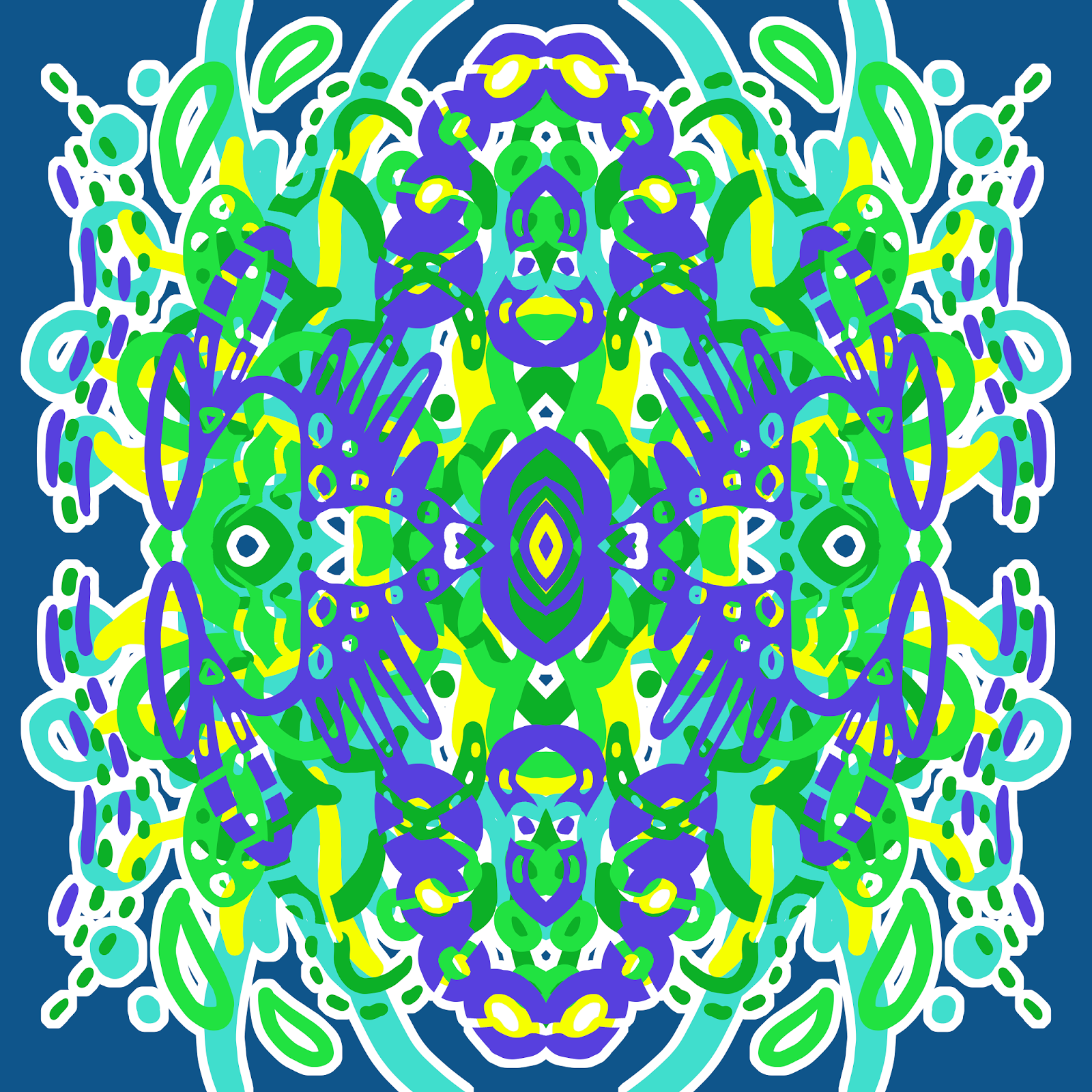
Showing posts with label white. Show all posts

Saturday, 21 November 2015

Basic Black and White Patterns

One thing I've learned while working with homewares is that it can be hard to find simple coordinates. There are plenty of busy, colourful patterned things available, but when someone wants a throw rug or cushion to match, it can be difficult. Monochrome solids are often the best option, but simple patterns in a smaller scale can work too. 

So I thought I'd put together some simple, plainer repeating patterns that might coordinate nicely with some busier ones.

"Simple Crosses", Digital, October 2015

"Simple Weave", Digital, October 2015


"Simple Triangles", Digital, October 2015

"Simple Stripes", Digital, October 2015

Sunday, 8 November 2015

"Autumn Flame" - Pals Paper Arts 274

Some days, whatever you try to create just doesn't work out. I knew I wanted to spend today creating new art because I had a decent chunk of time to do so. I tried about three different things before coming to the conclusion that being creative just wasn't happening for me today, so I decided to work on some more businessy things instead.


But still, I knew I wanted to create something nice today, because I knew I'd be a bit sad about it if I didn't make anything nice. This was my third attempt at the Pals Paper Arts colour palette for this week, and I'm glad I persevered, because I'm pretty happy with it. 

"Autumn Flame Repeating", November 2015, 15x15 Inch

I don't know how I keep end up doing the colour palette challenges with chocolate brown in them, and skipping the ones that don't. It's a weird trend for someone who isn't that fond of brown. But it works quite nicely with the coral and yellow colours, so I can't complain. 


Thanks for taking the time to look at my art. Don't forget to add Renee Dillon Art on Facebook and Instagram to keep track of my latest work.

Arabesque Trellis Preview

I'm currently getting back into the swing of things after a pretty solid month of work at my day job. It's nice to have the time and energy to be creative again. Sometimes you just need a bit of time to play. Unfortunately, I wasn't quite thinking when I created this pattern, because I managed to save this small preview sized image that I'm currently using as a desktop background, but not the original sized artwork that I was actually going to make something with. So that's frustrating. Luckily, it didn't come out quite how I wanted, so I was going to have another crack at it anyway. 

For now, here's the small version to show you.

"Arabesque Trellis", November 2015

I'm not even sure if that's clear enough for you to see, but it's the best I can do. Let this be a reminder to keep track of what you've saved when you're closing files. I have a bad habit of getting distracted mid project, and going to work on another image, so I often have about ten tabs open at the end of a session. Don't do this. Save what you need as you go.

But also, don't worry too much if you lose things. It happens. There will always be something else to draw tomorrow.

Monday, 26 October 2015

"Lady Beatle" - Digital Mandala

I adore the colours in this one. Shades of aqua/blue and pink together make me so happy. I thought this one looked like a scarab in feminine colours, so I called it "Lady Beatle".

"Lady Beatle", Digital, September 2015

Sunday, 25 October 2015

"Hibiscus and Pansies" - Floral Repeating Pattern

I keep coming back to pansies as one of my go-to flowers to draw. They have a nice shape to them, and they come in some pretty colours. I'd rather like this pattern on a summer dress.

"Hibiscus and Pansies", Digital, September 2015
I made this red hibiscus pattern first, before I drew the pansies. it looks very Hawaiian in red.

"Red Hibiscus", Digital, September 2015

Saturday, 24 October 2015

"Connection" - Digital Mandala

This one reminds me of those construction kits that were a thing when I was a kid. Not sure if they're still around. I think they were called Konnects or something. They were like plastic paddlepop sticks with holes in them. I've named this one "Connection" based on that memory.

"Connection", Digital, October 2015

Wednesday, 21 October 2015

"Circuit" - Digital Mandala

Tinkering with computers must have put me in the mood to draw something that looks like a piece of computer hardware. It must have been an unconscious connection, because I don't think I would have even noticed if it wasn't for the green and gold colours that look like part of a motherboard.

"Circuit", Digital Mandala, October 2015

Monday, 19 October 2015

"Cross Stripe" - Digital Mandala

Another mandala from back in September. I think I need to keep better track of which pictures I've uploaded and which ones are already on the blog. When everything is all together in one folder it's easy to lose things.

"Cross Stripe", Digital, September 2015

This one becomes a patterned stripe in tiling form, because the pattern doesn't touch the sides. So that's a kind of cool thing to do.

"Cross Stripe Tiling", Digital, September 2015

Sunday, 18 October 2015

"Blue Totem" - Digital Mandala

This is another one that didn't get posted from September. I like monochromatic colour palettes. Not much else to say about this one.

"Blue Totem", Digital, September 2015

Saturday, 17 October 2015

"Frogger" - Digital Repeating Pattern

Lots of blue and green shades in this one. The aqua dots make me think of the little sticky toes on a frog, so I've called it "Frogger". The more I look at it the more eyes I see.

"Frogger", Digital, September 2015

Friday, 16 October 2015

"Feather" - Seamless Repeating Pattern

At this point, I'm not even sure why I called this one "Feather", but that was what the file was called so I guess I'll go with that.

"Feather", Digital, September 2015

Thursday, 15 October 2015

"Mermaid" - Digital Mandala

I loved this one so much I made it my new Facebook cover image. In hindsight, I wasn't that happy with the 'temporary' art I'd put there but forgotten to replace. So glad I finally realised that I had nice new art to replace it with. The brighter colours really freshen the page up.

"Mermaid", Digital Mandala, October 2015

Tuesday, 13 October 2015

"Dream Catcher" - Digital Mandala

This is the other artwork I'm considering for my first printed handbags. I love the aqua and blue tones in this one, but I still think I'm edging just slightly towards the first. This one makes me think of feathered Native American headdresses or some kind of Mardi Gras decoration. 

"Dream Catcher", Digital Mandala, September 2015


I would have liked to create something new today, but I just spent the morning trying to fix some problems with my wacom tablet. It seems I need to spend an hour fixing things every time I try to create something. But I'm pretty sure I'm close to having all the kinks in my workflow ironed out.

Sunday, 11 October 2015

"Warm Flowers" - Color Throwdown 362 - Digital Repeating Floral Pattern

Today's pattern was made for Color Throwdown's colour palette challenge, but once again I was a day late to submit it to the link list on their website. Either way, I think it's worth posting here anyway. 


I took the inspiration quite literally, as I'd been wanting to draw some more floral patterns lately. This one has orange roses and red pansies, as well as random sprigs of mystery leaves and white dots. 

"Warm Flowers", October 2015


"Warm Flowers Tiling", October 2015

I don't mind how this came out, even though I'm not a fan of brown. This brown is pretty chocolatey, so it's not so bad. It's a pretty warm colour palette overall. This week's colour palette is a lot more pastel and beige, so I'm not sure if I'm going to try something with it. I'll see if I can make it work.

Thursday, 8 October 2015

"Disco Ant" - Digital Mandala

Another of my mandalas, completed back in September. I have to start posting these as I do them, rather than thinking of something clever to say, or they'll never get posted.

"Disco Ant", September 2015


Monday, 28 September 2015

"Ditsy Leaves" - Color Throwdown Challenge - Digital Repeating Pattern

Time for another colour palette challenge from Color Throwdown. I always intend to do these, but I rarely get around to them in time. I spend too much time trying to decide what I'm doing, and suddenly a week has gone by. This week's theme is green, yellow, black and white.


I wanted to make sure I submitted something, so here's just a quick ditsy leaf pattern. I'm starting to practice patterns where I have to arrange different elements and make them look like a balanced repeating pattern. This is a lot easier now that I have a Wacom tablet and can draw in additional elements to fill spaces rather than sketching on paper and scanning them in as I had to do before.

"Ditsy Leaves", Digital Repeating Pattern, September 2015, 15x15 Inch


It's still a bit rough and I might go back to clean it up later, but I'm pleased with the technique and look forward to doing it again with more complex pattern elements. Look forward to some paisley and floral patterns in the near future. 

Sunday, 29 March 2015

Valencia - Symmetrical Tiling Digital Abstract in Pink and White

Uploading images is not nearly as fun as creating art, but I'm starting to streamline the process a bit. Here's another of my new digital artworks. I named it Valencia because the little sections in the middle reminded me of orange segments. 

"Valencia", Digital Symmetrical Abstract


I really love the look of one colour on white. It's very simple, yet works so well. I'd love to have this pattern printed at Spoonflower and make it into a shirt or dress at some point. If you're interested in purchasing prints or items with my art on them, you can check out my Fine Art America or Society 6 stores. Fine Art America is also great if you want to see my art in more of a gallery format, rather than in blog posts. Thanks for looking. :)

Wednesday, 25 March 2015

Kurt - Digital Symmetrical Tiling Abstract

Lately I've been trying to upload some of my art on a stock photo website. I've been contemplating getting into digital downloads again, like the cat silhouettes I used to sell on Etsy. Actually I've been contemplating a lot of directions I could take my art, and it has left me at a bit of a standstill. I don't know the best way to tackle it, so I overthink everything and don't get much done. I know that I could spend many hours on a project, only to realize that my time would have been better spent another way.

This morning I spent about an hour uploading files to Society 6. I like the amount of control they give you, but wish the process could be more streamlined. There should be an option to upload the largest size file, have them automatically resized by their system to fit the dimensions of each product, and manually fix whichever products you might want to turn out differently. Maybe it's more complicated than that, I don't know. 

This is my latest addition to my Society 6 store, Kurt. I designed it in a few colourways, but only the teal and purple version at the top is in the store. I don't know that I have the patience for any more today. It's just a shame that things that shouldn't take so long take many hours away from actually being able to create new things. 


Check out my store on Society 6 if you want to see this design (and a few of my others) on mugs, tote bags and other products.

Tuesday, 10 February 2015

Taking the Plunge

Now that I'm not pushing myself to post everyday to my blog, I find that I'm trying to come up with blog posts that contain more substance. If I only post once or twice a week, I feel like I should be able to come up with something relevant or profound to say to accompany my art or my process. Which is all well and good. But the pressure of creating fewer, better quality blog posts is leading me to avoid posting at all. I've still been painting and drawing this past couple of weeks, of course. But the idea of the deadline that spurred me along is gone. I've been second guessing the things that I want to say and the work-in-progress paintings that I could have posted over the last few days.

I find that this happens a lot with my art. I'm getting better at the concept of just creating something, without worrying whether it will be right or good enough. But when it comes to things like taking print quality images of my finished art, connecting with other artists and bloggers, writing tutorials and useful guest posts to share my art around and developing blog traffic, I put it off. I think there's a part of myself that puts these things off because they make it too real. If I haven't done them yet, I can still consider myself to be at the beginning of my journey. I haven't made the attempt yet, so I can't consider that it hasn't worked.

It's not even the fact that I believe it won't work. I'm almost positive that if I do the things on my to-do list, it will increase traffic to my blog, followers on my Facebook page, sales of my prints and original paintings. But the nagging feeling is still there that it won't happen straight away, or at all. As long as these concepts are in the future, I don't have to deal with them just yet.

Now is the time to let go of that mentality, and move forward. It's time to start really trying to advance my artistic career and see where it takes me. One day I'd really like to be able to work as an artist full time, both teaching art and selling my work. The only way I'll ever get there is to do what any other successful artist has done - plunge in and start working towards it. It won't happen all by itself. There won't ever be a better time than now.

After writing this blog post and psyching myself up, I finally got a decent quality photograph and uploaded my artwork Austin to Fine Art America. Judging by my previous blog posts, I've been meaning to do this since about August last year. Better late than never. You can now buy prints of this image as well as throw cushions, phone cases etc. The original is also still available for sale for $1800.

"Austin", 29x39, Acrylic on Canvas, $1800


Saturday, 10 January 2015

30 Paintings in 30 Days - Day 10 - Jared

I've named this abstract Jared, mostly for the reason that I can't think of anything else to call it. Went with a male name this time, since it's fairly geometric, as opposed to some of my other abstracts like "Samantha". Might add some colour to it later, but for now I'm liking the black and white.


nRelate Posts Only