Showing posts with label tiling. Show all posts

Sunday, 25 October 2015

"Hibiscus and Pansies" - Floral Repeating Pattern

I keep coming back to pansies as one of my go-to flowers to draw. They have a nice shape to them, and they come in some pretty colours. I'd rather like this pattern on a summer dress.

"Hibiscus and Pansies", Digital, September 2015
I made this red hibiscus pattern first, before I drew the pansies. it looks very Hawaiian in red.

"Red Hibiscus", Digital, September 2015

Friday, 9 October 2015

Autumn Feathers - Pals Paper Arts Challenge 271 - Digital Mandala

A little out of my comfort zone with this colour scheme from Pals Paper Arts. Brown is well outside my usual choice of colours, but I guess that's what makes these challenges interesting. It's something a bit different, that you wouldn't have necessarily chosen for yourself. That makes it a bit more fun.


"Autumn Feathers", October 2015


I've posted both the single tile and the tiling version, as the tiling would be a bit harder to see in a thumbnail. Also I'm not sure if it's just me, but my blog pictures seem to be coming out a little blurry. I'll have to keep an eye on that. Hopefully it's just my imagination.

"Autumn Feathers", October 2015

Wednesday, 25 March 2015

Kurt - Digital Symmetrical Tiling Abstract

Lately I've been trying to upload some of my art on a stock photo website. I've been contemplating getting into digital downloads again, like the cat silhouettes I used to sell on Etsy. Actually I've been contemplating a lot of directions I could take my art, and it has left me at a bit of a standstill. I don't know the best way to tackle it, so I overthink everything and don't get much done. I know that I could spend many hours on a project, only to realize that my time would have been better spent another way.

This morning I spent about an hour uploading files to Society 6. I like the amount of control they give you, but wish the process could be more streamlined. There should be an option to upload the largest size file, have them automatically resized by their system to fit the dimensions of each product, and manually fix whichever products you might want to turn out differently. Maybe it's more complicated than that, I don't know. 

This is my latest addition to my Society 6 store, Kurt. I designed it in a few colourways, but only the teal and purple version at the top is in the store. I don't know that I have the patience for any more today. It's just a shame that things that shouldn't take so long take many hours away from actually being able to create new things. 


Check out my store on Society 6 if you want to see this design (and a few of my others) on mugs, tote bags and other products.

Sunday, 1 February 2015

Amy Work in Progress - Symmetrical Tiling Abstract by Renee Dillon

Here is my offering for the 1st of February, my very first hour of the month, as mentioned in my previous post. The first image was actually from January, and doesn't count as time spent in today's hour, but I thought I'd post it anyway. It's a digital draft or colour palette test that I whipped up by colouring over my sketch in Photoshop. I think I should do these colour tests more often, but I think I should stick to them rather than choosing random colours for the digital version and then choosing random colours again for the painting. The digital also tiles at a smaller scale than the original, which makes it harder to see the detail.


As usual, my photo of the painting is a little crooked, so please forgive that. Also, the colours didn't photograph very well. The grayish colour you're seeing is supposed to be metallic purple paint, which looks quite nice in real life. The yellow and green were markers, because I thought I'd go a bit more mixed media with this one and see how it turned out. The markers definitely give a lot more control in small spaces, which I like. Bic Mark-Its also seem to be fairly streak-free in small spaces as well, which I love.

I won't necessarily be trying to post daily in February, but I'll try to stay on the wagon as far as actually creating art goes. Wish me luck!

Total Time Spent Making Art in February: 1 Hour

Monday, 26 January 2015

30 Paintings in 30 Days - Day 20 - Wilma WIP 1

Started adding colour to Wilma. I added the orange first, then took a little bit of a left turn from my original colour ideas and started adding a powdery blue instead of aqua shades. 


Saturday, 24 January 2015

30 Paintings in 30 Days - Day 19 - Wilma Lineart

Here's the lineart for my tiling abstract, Wilma. I'll be able to start painting it later today. I was annoyed while projecting it onto the paper because the computer went to sleep half way through and when I turned it back on it had moved slightly. I managed to move the paper to line it back up, but trying to move the projector back into the right position was impossible. Lesson learned - next time I'll have the computer play a movie in the background or something so it doesn't think I'm not doing anything with it. Usually I have music or something playing, but today I was listening to the rain outside while drawing.

Thursday, 22 January 2015

30 Paintings in 30 Days - Day 18 - Wilma Work in Progress

Taking a break from the "Goldfish Girl" I have been working on, to start a new tiling abstract. I've missed working on larger abstracts, so it will be nice to paint another one. This one is only 12x12 inches, so not as large as "Austin", but still larger than the 4x4 inch abstracts I tried earlier this month.


I'm thinking of using a colour palette of shades of teal and aqua, bright orange and cream/beige.

Friday, 5 September 2014

"Jasper" - Color Throwdown Challenge CTD308 - Digital Seamless Tiling Abstract Design in Yellow, Orange and Pink

Yellow, pink and orange is one of my favourite colour palettes, so I was very excited when I saw this week's Color Throwdown Challenge. This week I decided to go back to seamless tiling abstract artworks. I haven't been making enough abstracts lately, and I need a few to get some greeting cards or post cards printed up. Also a few Spoonflower fabric designs. Maybe some throw cushions. I'll see where it takes me.


I went a smidge brighter on the yellow to get it a bit closer to the banana yellow shade of the bottles. That shade of orange is similar to the one I used on "Austin", which reminds me of orange sherbet. The shapes I've used came out looking like lanterns and hourglasses. That's one of the things I love about making symmetrical tiling abstract art - you can get an idea of how something is going to turn out, but the end result is almost always surprising in some way.

Geometric seamless tiling abstract digital artwork by Renee Dillon. Colours are pink, yellow and orange. Named "Jasper".
"Jasper", Digital Seamless Tiling Abstract Art, 6x6


Remember to follow Renee Dillon Art on Facebook if you'd like to stay up to date with my new work. Thanks for looking. :)

Friday, 27 June 2014

Art Nouveau Style Acrylic Painting - Work In Progress

Admittedly, it's been a little while since I've updated my blog. Mostly that's because I've been thinking of taking my art in a new direction lately. I enjoy making tiling patterns. I enjoy fabric design and scrapbook paper design. But the design part of that equation was where I stopped enjoying what I was doing. There were things to contend with like deciding how many papers to go in a pack (while still fitting the upload limit on Etsy) and working out what size repeats should be to fit people's craft projects. I wasn't feeling satisfied about the end result because the colourways I really loved got lost among the colourways I figured someone else might like.

So ultimately, I decided to work bigger. Rather than making art that exists only in the digital world, I'd like to get back to creating art that exists in real space. A real, tangible thing that I can look at and say "Yes, I made a thing." Put it on a wall, maybe, I don't know.

I like the idea of creating something that is infinitely reproducible, that can be used and enjoyed by many people. But I also like the idea of something of which there is only one - something collectible and coveted and rare. I like the thought of somebody seeing my art and loving it so much that they want to put it in their house and look at it every day. And I like the idea of people seeing my art on this blog or social media and just enjoying what I do for free, as I've enjoyed the work of so many artists who share their work with the world.

All of this soul searching has resulted in me deciding to try a big canvas artwork for a change. Not something I'm typically comfortable with. My usual working size is less than A4 (usually even less than A5). I wanted something with large visual impact, though, and I knew for an abstract that the scale would be an important factor. What I've ended up with, so far, is this.


I'll go through the process in a future post, but basically it's a geometric Art Nouveau style abstract. It will be painted with yellow, orange, sky blue and hot pink acrylic (Jo Sonya and Monte Mart Silver Series paints). The thick black lineart was painted with a Posca paint pen. I'm sticking with my love of tiling, seamless, repeating patterns. I actually really liked it at the lineart stage, so in future I might work on some purely black and white pieces too.

Once it's complete I'll have to think of a name. Once again, I'm thinking of giving my abstracts people names rather than vague artsy nonsense. There's just something I like about a painting called Margaret or Georgia or Sam. It makes the painting seem friendly and relatable. After that I'll probably set up an account on Saatchi Art. Maybe I'll put it in my (currently empty) Etsy shop.

Come back soon to see the colours start to go on. I'm already really pleased with how it's turning out and can't wait until it's finished.

Monday, 17 March 2014

Pals Paper Arts Colour Challenge - PPA 195

Getting in just in time for this challenge at Pals Paper Arts. I liked the colour scheme so much that I couldn't quite decide what I wanted to do with it. In the end I went with some bunny silhouettes and a cutout rectangle Happy Easter banner. I like the cutout words technique over patterned paper and will be using it again. Probably with a smaller print next time.


I've been finding that I like using simple card designs and letting the patterned paper speak for itself, but I'd like to get into a bit of pattern mixing. Maybe next time. As always, you can find my papers at Sixth Floor Studio on Etsy. These bunnies might be up in the next couple of days.

Tuesday, 11 March 2014

Cardmaking Challenge - FTTC 262


I tried my hand at another digital greeting card tonight. This one was inspired by the Flourishes "It's a Wash" Challenge. The theme was washi tape, and I'm not sure that fake digital washi tape counts but it looked fun so I thought I'd try anyway.


I shrunk the pattern on my paper called Christina to make faux washi tape strips. Not sure how I feel about the empty space in the top right corner. Maybe I should have made the strips horizontal to full that a bit more, or made the card square so it wasn't such a large space. Never mind.

If you're interested in checking out this patterned paper for yourself, take a look at Sixth Floor Studio on Etsy. Thanks for looking.

Christina

Abstract patterns are harder to name than figurative ones. This pattern started with the name 'Diamond Rift', but I wasn't sure I liked that. Then it had the working title 'Circular' while I finished it off. Eventually I decided that I'd rather give my abstract patterns proper names. This one is Christina.


It took a bit of fiddling, but I'm glad I finally managed to make this design tile properly. If you'd like to buy it, head to Sixth Floor Studio on Etsy. Thanks for looking. :)

Monday, 10 March 2014

Pals Paper Arts Colour Challenge - PPA 194

I'm not much of a cardmaker, but I like the idea of challenges, especially colour palette challenges. I thought I'd have a go at the Colour Challenge at Pals Paper Arts.


Above is the colour palette I had to stick to. Not my usual cup of tea, but I guess that's the point of a challenge. It can be good to try things that aren't in your comfort zone.


My friend has a birthday coming up and his favourite colour is blue. The flowers might be a bit girly, but hopefully he won't mind. So that works out nicely.

If you'd like to see the rest of this scrapbooking paper set, have a look at my Etsy shop or look at the previous blog post. Thanks for looking and have a great day.

Overlapping Flowers

Finally opened a Twitter account today. My opinion that I would not like Twitter has not yet changed, but apparently it's pretty big in the scheme of social media and reaching new audiences. You can find and follow me @6thFloorStudio (apparently typing "Sixth" made it too long). As a known rambler, having an arbitrary post size limit bugs me. I don't like changing the grammar in a sentence so I don't have to remove content, but that's what needed to be done to fit my first tweet within the limit. What was the problem with blogs, anyway? You can be as long-winded or brief as you like, and people can follow you and see what you have to say. And you don't have to figure out this ridiculous hash-tagging business. I sound so old.

Anyway, here is my new scrapbook paper set. I'm still playing with ways to make tiling images. Spacial thinking isn't necessarily my strong point, but I'm getting better. It gives me one of those special headaches that mean you must be growing new neural pathways in your brain.


I've made one of these papers into a digital card for Pals Paper Arts Colour Challenge. That can be found in the next post. If you'd like to purchase these papers, take a look at Sixth Floor Studio on Etsy. Thanks for looking.

Saturday, 8 March 2014

Corgis

One thing I anticipate about starting up a blog and a business selling art is that the beginning will be fairly quiet. The internet is a big place, and content doesn't come up in a search necessarily because it's what you're searching for. What I've learned about Search Engine Optimization so far indicates that there are a lot of little rules to follow if you ever want anyone to find you. Apparently having a free blog rather than a paid website and domain name is a bad start for SEO purposes. Links from other websites (particularly high traffic ones) boost web search ranking. Frequently updating content can apparently help. 

But despite the tiny amount of SEO tips I've learned, I figure I'm still going to have to be pretty patient. Every time I see a new page view on my blog or Etsy shop, I get a little bit excited. It means that a person, even a single person, maybe only for a brief moment, has seen what I've created and acknowledged it in some small way. They might not even like it, but that's not the point. At least someone else in the world knows that it exists.

It's weirdly validating for your efforts to be seen. I could draw every day and keep my art in a box in my bedroom if I wanted to. But I want to share it, as scary as that is. It's like sending a tiny, vulnerable piece of yourself out into the world. Hopefully one day soon I can share my art with more people.
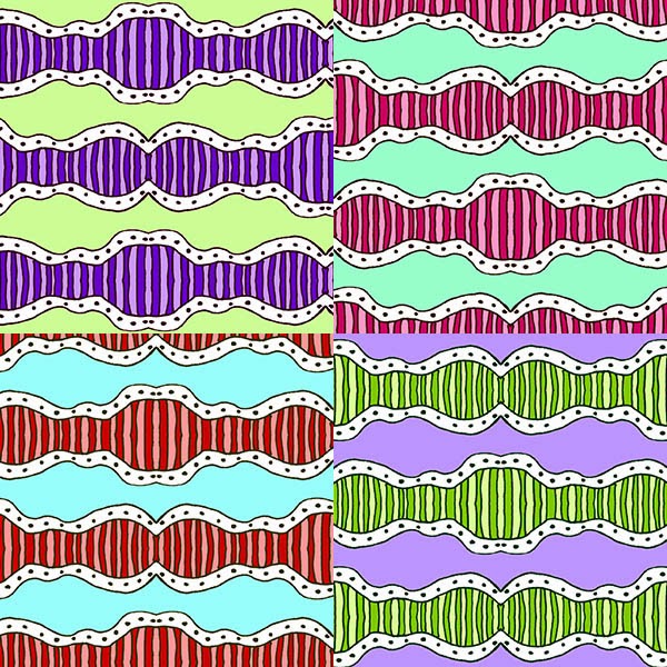

This happy corgi design is one of my favourite papers so far. I need to draw more dog papers.


If you want to see more of my papers or purchase this one, head to Sixth Floor Studio on Etsy. Thanks for looking. :)

Saturday, 1 March 2014

Wobbly Lines

This one is more abstract, a wobbly line design. I feel like the colours are a bit all over the place, as I wasn't planning as I worked, but I've learned from that experience since making this set. It can be important to think of how a set of papers will look as a whole, as well as individual papers, as that's the first impression customers get of your set.


I like the white page with black lines. It could be used like a colouring in page for people that want to make their own colour schemes. If you want to buy this set, go to Sixth Floor Studio on Etsy. Thanks for looking. :)

Thursday, 20 February 2014

Broody Chickens

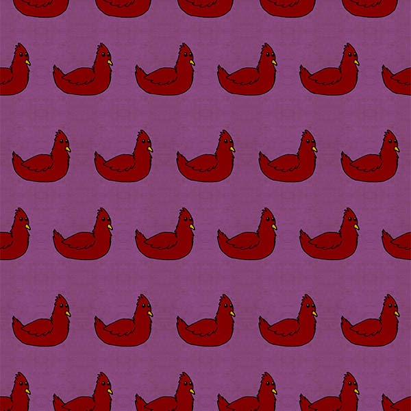
My new Easter design, Broody Chickens has just been uploaded in my Etsy store. It comes with a simple polka dot pattern set in matching colours. Not sure if I should keep working on Easter designs or if I should build up a stock of year round patterns. Either way, I think these chickens can be used for other projects at other times of year.


If you want to buy this set, go to Sixth Floor Studio on Etsy. Thanks for looking. :)

Wednesday, 12 February 2014

Pastel Easter Eggs

One thing I was really hoping to do with my new shop was get Easter themed stock in time for Easter. It's kinda hard to plan ahead for a holiday. It requires thinking ahead enough that you have time to create and list an item, and customers have time to find that item and make their own crafts out of it. The middle of February might seem a little early to be planning for the 20th of April, but that time counts. There's no point starting on a new set of images the day before a holiday (hence the lack of Valentines images for tomorrow). 


I went with a pastel colour scheme and a punchinella style which can be used for art and craft projects year round. I also have some bunny and chicken themed papers in the works, which should be available in the next few days.


Tuesday, 11 February 2014

Tropical Pineapples

So pleased with my progress today. I've had some test prints of my papers made at Officeworks and they look great. Now I've opened up the Etsy shop at long last. Click the link to see Sixth Floor Studio on Etsy. Or you can check out my happy little widget in the sidebar.

Also, here are some happy pineapples. This purple version is one of the ones I printed today, and it looks delicious. The pineapples look so juicy and delicious in print. I'll definitely be using the yellow/green/purple colour scheme again in future.


Here is the first colour preview. To see all of the colours, go take a look in my Etsy shop. 


Monday, 3 February 2014

Watercolour Butterflies

These butterfly designs were the first series of images I made for my Etsy shop. They were coloured with watercolour pencils and altered digitally. There are 14 pages in total and the previews below show the assortment of colours.

If you're interested in purchasing these printable papers, you can find them at my Etsy shop, TheSixthFloorStudio, which will go live shortly.


I'm rather pleased with how this pattern turned out. Hopefully there will be more traditional media papers in the future.

nRelate Posts Only