Showing posts with label drawing. Show all posts

Saturday, 23 January 2016

Artist Progress 2016 - Faces

I looked over my older blog posts recently, and realised that not that much was really documented. It was interesting to see what was there. Each post was like a moment in time that I was taken back to. I didn't write a lot about my personal life or anything like that, but memories were still there, attached to the art and the words. It made me realise that I'd really life to blog more often, to keep more of these little parcels of time to look back on.

One thing I'd really like to start doing is practicing more, and having a set point to look back on, which I can say "this is what I could do then" and "this is what I can do now." I've decided that I'd like to create a few different artworks in about January and February each year, then try to recreate similar things at the same time next year, to see what progress I've made. I don't really have a set point to compare to from last year, but I have to start somewhere.

"January 2016 Traced Portrait", Digital, January 2016

I've been wanting to draw some more portraits, so this is hopefully the first of many. For full disclosure, this one has been traced over the top of a photograph, not drawn freehand. I know some people have a problem with that, but I find that tracing over an image helps you to look at lines in a different way than if you just look at the image as a whole, so I think it still has merit as a learning tool.

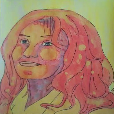
"January 2016 Freehand Portrait", Digital, January 2016

This one was drawn freehand while looking at a reference photograph. I added the flowers in her hair because I was getting bored by that point. That's also the reason I didn't shade this one, but I imagine the shading would have been pretty similar in style to the traced portrait.


This one is also available on my Youtube channel, Renee Dillon Art, if you'd like to watch me draw it and ramble a bit about nothing. Hopefully now that I've learned to record and add my voice to videos I'll have more important things to say in future,

Monday, 26 October 2015

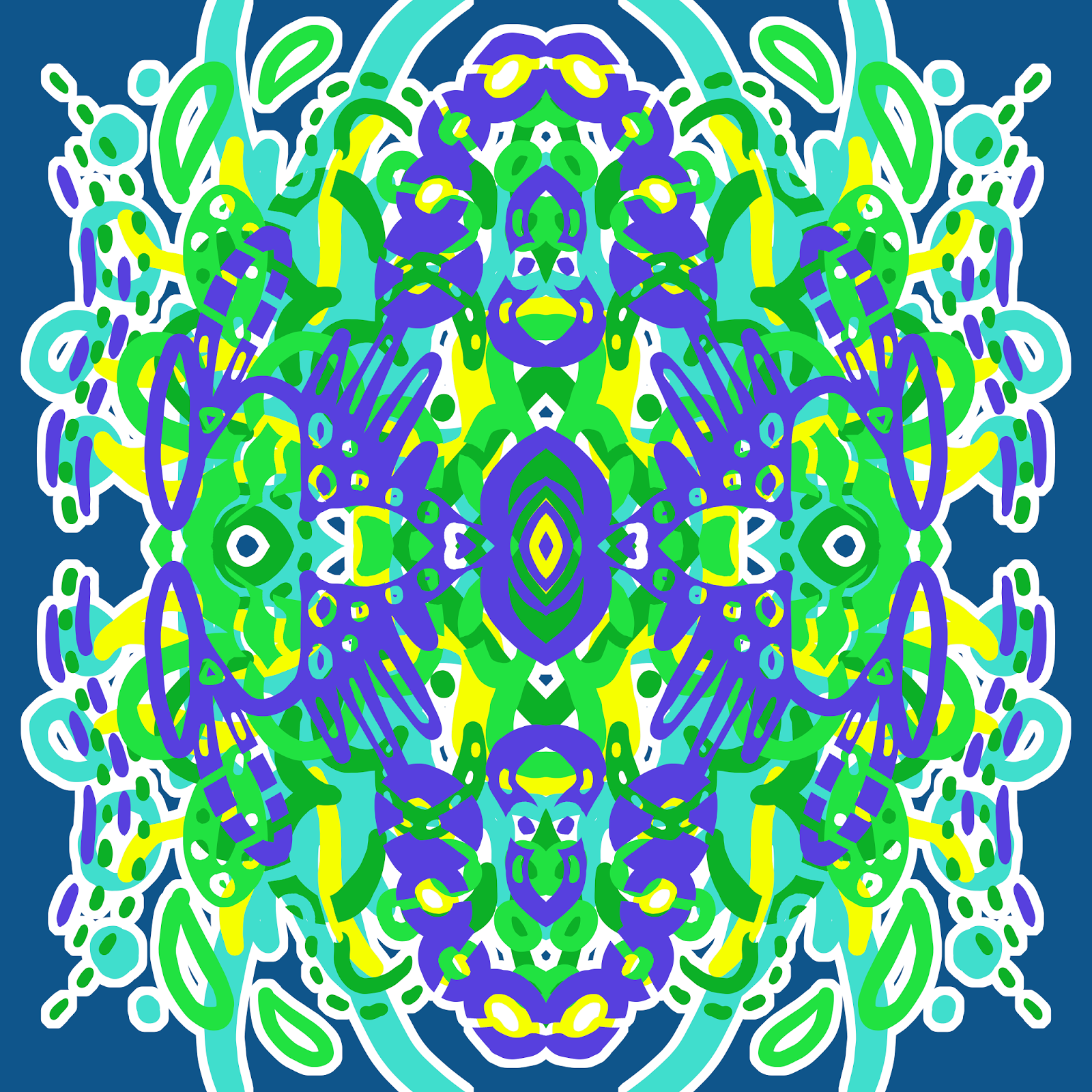
"Lady Beatle" - Digital Mandala

I adore the colours in this one. Shades of aqua/blue and pink together make me so happy. I thought this one looked like a scarab in feminine colours, so I called it "Lady Beatle".

"Lady Beatle", Digital, September 2015

Friday, 23 October 2015

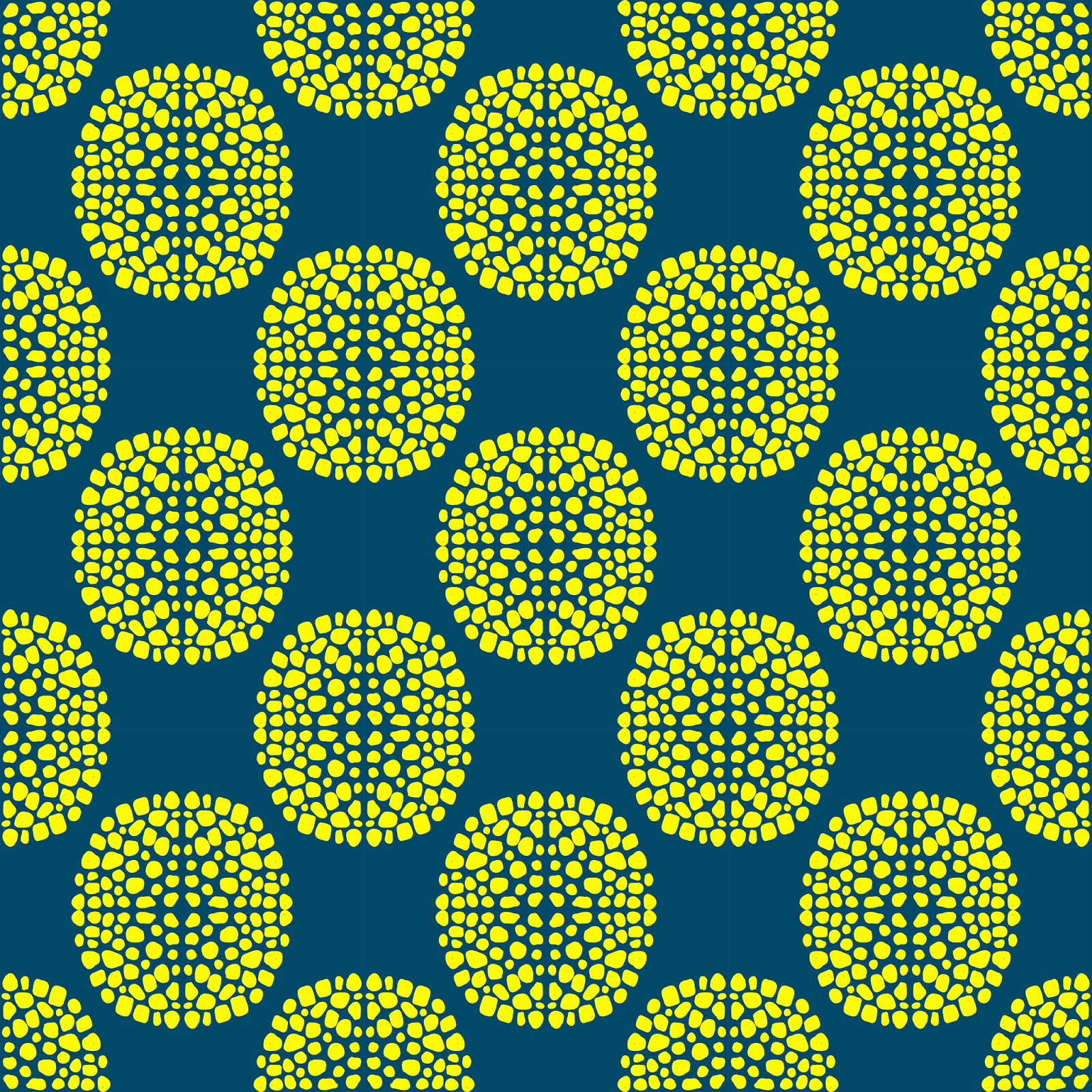
"Corn" - Digital Repeating Pattern

A friend of mine just posted a picture of his dinner on Facebook. His delicious corn-filled taco meat inspired me to make this pattern. Now I'm hungry.

"Corn", Digital, October 2015


Sunday, 18 October 2015

"Blue Totem" - Digital Mandala

This is another one that didn't get posted from September. I like monochromatic colour palettes. Not much else to say about this one.

"Blue Totem", Digital, September 2015

Saturday, 17 October 2015

"Frogger" - Digital Repeating Pattern

Lots of blue and green shades in this one. The aqua dots make me think of the little sticky toes on a frog, so I've called it "Frogger". The more I look at it the more eyes I see.

"Frogger", Digital, September 2015

Monday, 28 September 2015

"Ditsy Leaves" - Color Throwdown Challenge - Digital Repeating Pattern

Time for another colour palette challenge from Color Throwdown. I always intend to do these, but I rarely get around to them in time. I spend too much time trying to decide what I'm doing, and suddenly a week has gone by. This week's theme is green, yellow, black and white.


I wanted to make sure I submitted something, so here's just a quick ditsy leaf pattern. I'm starting to practice patterns where I have to arrange different elements and make them look like a balanced repeating pattern. This is a lot easier now that I have a Wacom tablet and can draw in additional elements to fill spaces rather than sketching on paper and scanning them in as I had to do before.

"Ditsy Leaves", Digital Repeating Pattern, September 2015, 15x15 Inch


It's still a bit rough and I might go back to clean it up later, but I'm pleased with the technique and look forward to doing it again with more complex pattern elements. Look forward to some paisley and floral patterns in the near future. 

Sunday, 26 April 2015

Catching Up on Blogging for April

Looks like I'm going to have to give myself a more structured blogging schedule, or I get distracted and fall behind. We're already nearly all the way through April without a blog post, and that's ridiculous. I have been working on a few things, just moving on to something else before I get around to blogging about them.

This month, I've been poking around in thrift shops, looking for homewares that I can dress up with a bit of paint. For some reason I started looking at interior design blogs and I've become a little obsessed with shelves covered in pretty things. Now I want to make colour coordinated covers for all of my books and fill my shelves with fun, quirky objects. I've also been trying to clear away things I don't want or need anymore, so I can easily find the things I do need, like certain art supplies, or a free bit of desk to sit at and draw.

I've also decided that I want to extend my reference library. The internet is invaluable when you're looking for some inspiration about what to draw, but there's something to be said about just sitting down with a book filled with photographs to find something too. I've been looking for a good reference book for different types of flowers for a while. So far "Dig Deeper" by Meredith Kirton is looking like a good option for me. I also bought "The Encyclopedia of the Horse" while I was thrift shopping, and I'm so excited that I found it. 

My goal now is to post a new blog post at least once a week, preferably on Monday. I'd like to say more about what I'm up to at any given time, so I can look back on this blog in future as a little time capsule. It would be nice to have reminders of little moments that might otherwise be forgotten.

I'll probably come back to actually add pictures to this post later, but for now, I'm feeling creative. Go make some art.

Tuesday, 17 February 2015

"Amy" - Symmetrical Tiling Abstract in Acrylic Paint

So I've been keeping at my plan to create for an hour a day during February. I'm already a little bit ahead for tomorrow. I find it interesting that sketching and lineart seems to go by so fast, I finish a drawing and I've hardly used up any of my time, yet when I sit down to paint it feels like the time flies by. Maybe I'm focusing harder when I have the paints out because painting is still so strange and different for me. I've been drawing for years, but I'm still quite new to paints, in a way.


Blogger is refusing to justify my text for some reason. It's annoying me to no end.

Paintings in the Works: "Sargent Peanutbutter" the Horse, "Cookie" the Pug, "Fizzy" the Pug, "Lesley" the Cow, Other Misc Art

Tuesday, 20 January 2015

30 Paintings in 30 Days - Day 17 - Goldfish Girl Work in Progress 2


More of my Goldfish Girl, now with dark hair. I still haven't had much of a chance to work on it lately. The time I've been at home has usually been waiting for someone to arrive, which makes it tricky to pull out the paints when at any moment you may need to pack them up again.

I'm a little behind due to other commitments, but hopefully I'll have another chance to create today.

Sunday, 18 January 2015

30 Paintings in 30 Days - Day 16 - Goldfish Girl Work in Progress 1

I've started my next 12 x 12 portrait. This one is taking a little longer because I had a friend in town at the moment, which cuts down on available painting time. I started wit a layer of orange and blue leftover paint from the previous painting, which I spread liberally over the surface. Some of it mixed to make a surprisingly nice green. I'm pretty picky with greens, usually. I then drew my lineart directly over the painted page with a Bic mark-it pen in Tuxedo Black.


The orange sploshes amongst the blue remind me of goldfish swimming in a pond, hence the title "Goldfish Girl". She also looks a bit like a hipster in those glasses, so she reminds me of the Starbucks logo mermaid.

Not quite sure where to take it from here. I guess wait and see.

Saturday, 17 January 2015

30 Paintings in 30 Days - Day 15 - J K Rowling Final Mixed Media Portrait

I'm guessing this is the second last picture of J K Rowling. All I have left to do is touch up the lineart that has been hidden under layers of paint, then she's done. I'll probably edit this post with the finished artwork rather than make a new post, because six posts of J K Rowling is probably at least 4 posts too many. 


I've painted this portrait on the back of a piece of 12 x 12 scrapbooking paper I bought from GOLO when they were closing down. I wanted to see if scrapbooking paper made a nice surface for painting on, and so far I'm pleased. It held up nicely to layers without too much creasing or buckling, which is good. It's kind of a cardstock thickness. I'll have to check what gsm is written on the paper pad. I might keep an eye out for seasonal paper pads when they're on sale, because I predict I'll be using them for painting again in future. Maybe after next Christmas I'll have finished with the paper I have and it will be the perfect time to buy a new one.


Here's the final piece with reinked lineart, unless I choose to go back and figure out where the rest of the lines in the hair go, Which I might, but that's a job for later. Tomorrow, a new piece of art.

Wednesday, 14 January 2015

30 Paintings in 30 Days - Day 14 - J K Rowling Work in Progress 2

So now J K Rowling has dark hair and looks nothing like J K  Rowling. Admittedly, it wasn't a great likeness to begin with, but now she looks like an entirely different woman. I wanted to cover the splatters with my house paint sample - a British Paints sample pot in the colour Blue Gum Park - then go over that with a lighter blue that would be more similar in value to her actual blonde air. I'm getting into the process of layering different colours to add depth to the final painting. It will be easier once I figure out how all of my different brands and types of acrylic paint react to each other.


PRODUCTS USED (Assorted brands of paints):

30 Paintings in 30 Days - Day 13 - J K Rowling Work in Progress

I've started adding some colour to the J K Rowling sketch I painted yesterday. The splattery texture in the hair is there to cover up some lines I didn't want to keep. I added more spatters to make it look like a uniform pattern rather than one random splodge where the line was. It will mostly be covered up when I add the additional layers of hair colour anyway, but I wanted to make sure the original line wouldn't be visible.


I know I'm technically not posting a new artwork for the 30 Paintings in 30 Days challenge today, but I've decided that I'd rather do part of a larger artwork each day than pump out 30 smaller, less polished artworks for the month. As long as I'm continuing to draw, paint and experiment with different ideas and techniques, and as long as I have something to post each day, I feel like I've accomplished what I intended to anyway.

PRODUCTS USED (Assorted brands of paints):


EDIT: Added these two posts into one because there wasn't that much progress between the two images.


Next step in the J K Rowling portrait. I've added some more shading and highlights to the face to make it look a bit less flat. I've used yellow, orange, red, magenta and blue to create the kind of purpley hue I've ended up with, which I quite like. The hair spatters are looking quite messy now, so hopefully they'll be covered up in the next step.


I'm probably going a bit overboard with the amount of blog posts for this one piece of artwork, but I like documenting the process for future reference. Maybe one day I'll look back at this and think "Good grief, why did I do it like that?" Only time will tell.

PRODUCTS USED (Assorted brands of paints):
 

Tuesday, 13 January 2015

30 Paintings in 30 Days - Day 12 - J K Rowling Sketch

Going back to working on some portraits today. Here's a 12x12 sketch of the author J K Rowling I'm working on at the moment. I'll need to fix the hair a bit in the painting stage, but hopefully that goes alright. I still have to decide what kind of colour scheme I'm using as well. I can't decide what would suit best.   

Friday, 9 January 2015

30 Paintings in 30 Days - Day 9 - Beach

So here's a drawing of a beach in coloured pencil and ink. The colour of the sky and water seem to be too close together in this picture. The sky is more purple in the original. Every day, I have less and less to say about these pictures. Daily posting is hard.


30 Paintings in 30 Days - Day 8 - Elephant

This time, I painted a little elephant. The background was originally orange, then painted over with green. It does provide an interesting depth of colour. I'll have to try that again. Maybe next time I'll underpaint a whole image, then paint over it again in contrasting colours.


Wednesday, 7 January 2015

30 Paintings in 30 Days - Day 7 - Two Pears with Dots

Experimented a little with using strongly contrasting colours to make shading and texture with this one. The white of the polka dots was done with a sakura gel pen, but I think I might go over it with white paint as well. Next time I try some colourful pears I might try adding even more colours. It's hard to experiment with things that need a lot of layers to dry when you want to upload something every day.


Tuesday, 6 January 2015

30 Paintings in 30 Days - Day 5 - Orange Cat

I've been drawing a few cats this month. I'd like to improve my drawings of cats, since it always frustrated me as a kid when the cats I drew looked like monkeys. It's kinda nice to think back to things like that and realise that you must have improved since then, and will continue to improve in future. I'm still a bit frustrated with my painting abilities. There are some bits I need to touch up where the paint brush got away with me, and I need to plan out my colour palettes better.


I'm going to go back over the lineart with my pen when it's dry so it looks dark and bold again. Might add some detail with coloured pencils as well, such as colouring the stripes.

Monday, 5 January 2015

30 Paintings in 30 Days - Day 4 - Purple Dalmatian

Another entry for Leslie Saeta's 30 Paintings in 30 Days challenge. Actually used a little paint on this one, in the brief time I had this morning. I haven't got a finished artwork ready to go for tomorrow. I'm considering cutting back a bit, and challenge myself to creating a bit each day without worrying about whether I have a finished artwork or not. I want to have a portolio of artwork at the end of this month that I can actually be proud of. 


On the other hand, maybe I shouldn't focus so hard on what I'm creating during January, but rather the process of building habits and trying things. I've already experimented a little during this challenge, maybe that's a good thing. Even if the experiments didn't result in artwork that I'd be pleased to show off. 

I may even go back after the month is finished and work more on the artworks I think aren't quite finished. Teaching myself that it's okay to rework things might be good for me.

Saturday, 3 January 2015

30 Paintings in 30 Days - Day 3 - White Cat

I'm still getting used to the timing of uploading art to the 30 Paintings in 30 Days challenge. I seem to have a little more than 24 hours to upload each link to Leslie Saeta's blog, which is handy. This might mean the days on my blog posts themselves are a little off, but never mind. 

My offering for Day 3 is another cat portrait, this one a little bigger than the last (though you can't really tell because I upload all of my pictures to my blog at 500 pixels wide). It's proving a little challenging to work at 4 by 4 inches. Small artwork means there aren't a lot of large areas to fill in, but they still require some finesse to cram much detail into a small space.


Again, the colours are a little off because of the photo. I'll have to get the scanner back into my room soon so I can get better quality images more easily.

nRelate Posts Only