Showing posts with label repeating. Show all posts

Sunday, 10 January 2016

30 in 30 - "Springtime" Repeating Design and Handbag Concept

One of the hardest things I find about creating something is creating with a purpose in mind when you start. It's easy to tinker about until you create something you really like through experimentation. it becomes difficult when you want to create a product, have many copies manufactured and shipped at great upfront expense, and just hope people like it enough to buy them. If you think you're self conscious about your art, try backing it enough to spend several thousand dollars on the hope that someone will like it. It's scary stuff.

This is my latest creation. I've been trying to come up with some more designs to print on handbags. I think this one would make a nice bag, so I hope people agree with me.

Day 10

"Springtime", Digital Art, January 2016

I made a mockup of what it would look like repeating on a bag.


Let me know in the comments section what you think of this bag design. Your feedback will help me to decide which bags to have made. Thanks for looking!

Wednesday, 23 December 2015

Poinsettia Christmas Flower Repeating Pattern

I had so many Christmas designs ready to go, and somehow December has almost crept away from me without posting any of them. This poinsettia design is bright and cheery. It puts me in the mood to draw some more floral designs.


Merry Christmas, everyone! Thanks for looking.

Monday, 14 December 2015

"Dreamcatcher" Repeating Pattern - With Video

I finally decided to figure out how to use Shadowplay to record my desktop and put some of my art process up on Youtube. I only have a couple of drawings on my Youtube channel from a long time ago, but I liked the idea of posting on there.

"Dreamcatcher Mandala", Single Tile

"Dreamcatcher Mandala", Repeating Pattern

If you'd like to watch me drawing this pattern and get an insight into how I create my artwork, go to my Youtube channel, Renee Dillon Art.

Sunday, 22 November 2015

"Succulent Christmas Fern" - Christmas Themed Repeating Design

One thing I've learned about Christmas designs is that the best ones in my opinion are the ones that aren't necessarily that Christmassy. There are plenty of designs that look like Christmas decorations at the time, but don't look out of place for the other eleven months of the year. That means you get a good amount of use out of them, without having to find somewhere to store your decorations. That's what I was thinking when I came up with this design.

"Succulent Christmas Fern", November 2015
I think this would make lovely place mats or napkins for a Christmas place setting with red and white accents (such as plates, napkin rings or table runners). Or if you want a non-seasonal place setting, it would still look nice with neutrals such as cream or white.

"Succulent Christmas Fern Repeating", November 2015
I'd like to think more about designs that can be used outside of Christmas time, especially since a lot of people like to change their Christmas decoration colour scheme every year. If those people can resell or give away their decorations to people that can use them straight away rather than waiting until next Christmas, the decorations are more likely to be reused rather than thrown away.

Sunday, 8 November 2015

Arabesque Trellis Preview

I'm currently getting back into the swing of things after a pretty solid month of work at my day job. It's nice to have the time and energy to be creative again. Sometimes you just need a bit of time to play. Unfortunately, I wasn't quite thinking when I created this pattern, because I managed to save this small preview sized image that I'm currently using as a desktop background, but not the original sized artwork that I was actually going to make something with. So that's frustrating. Luckily, it didn't come out quite how I wanted, so I was going to have another crack at it anyway. 

For now, here's the small version to show you.

"Arabesque Trellis", November 2015

I'm not even sure if that's clear enough for you to see, but it's the best I can do. Let this be a reminder to keep track of what you've saved when you're closing files. I have a bad habit of getting distracted mid project, and going to work on another image, so I often have about ten tabs open at the end of a session. Don't do this. Save what you need as you go.

But also, don't worry too much if you lose things. It happens. There will always be something else to draw tomorrow.

Monday, 26 October 2015

"Lady Beatle" - Digital Mandala

I adore the colours in this one. Shades of aqua/blue and pink together make me so happy. I thought this one looked like a scarab in feminine colours, so I called it "Lady Beatle".

"Lady Beatle", Digital, September 2015

Sunday, 25 October 2015

"Hibiscus and Pansies" - Floral Repeating Pattern

I keep coming back to pansies as one of my go-to flowers to draw. They have a nice shape to them, and they come in some pretty colours. I'd rather like this pattern on a summer dress.

"Hibiscus and Pansies", Digital, September 2015
I made this red hibiscus pattern first, before I drew the pansies. it looks very Hawaiian in red.

"Red Hibiscus", Digital, September 2015

Saturday, 24 October 2015

"Connection" - Digital Mandala

This one reminds me of those construction kits that were a thing when I was a kid. Not sure if they're still around. I think they were called Konnects or something. They were like plastic paddlepop sticks with holes in them. I've named this one "Connection" based on that memory.

"Connection", Digital, October 2015

Friday, 23 October 2015

"Corn" - Digital Repeating Pattern

A friend of mine just posted a picture of his dinner on Facebook. His delicious corn-filled taco meat inspired me to make this pattern. Now I'm hungry.

"Corn", Digital, October 2015


Thursday, 22 October 2015

"Ditsy Daffodils" - Colour Throwdown CTD364 - Repeating Floral Pattern

The running shoe seems appropriate because I'm in the middle of a marathon of shifts at work. My blog posts for the last few days have been scheduled and updated automatically, which is good because I've hardly had time to touch them. Unfortunately that also means I forgot to upload this one in time to add it to the list on the Color Throwdown website. Aah well.


I miss drawing at the moment, but in a couple of days I'll have a day off, so hopefully I'll get something done and won't be too tired to work on the ideas that have been floating around in my head lately. Today, here's a ditsy daffodil pattern, 


Wednesday, 21 October 2015

"Circuit" - Digital Mandala

Tinkering with computers must have put me in the mood to draw something that looks like a piece of computer hardware. It must have been an unconscious connection, because I don't think I would have even noticed if it wasn't for the green and gold colours that look like part of a motherboard.

"Circuit", Digital Mandala, October 2015

Monday, 19 October 2015

"Cross Stripe" - Digital Mandala

Another mandala from back in September. I think I need to keep better track of which pictures I've uploaded and which ones are already on the blog. When everything is all together in one folder it's easy to lose things.

"Cross Stripe", Digital, September 2015

This one becomes a patterned stripe in tiling form, because the pattern doesn't touch the sides. So that's a kind of cool thing to do.

"Cross Stripe Tiling", Digital, September 2015

Tuesday, 13 October 2015

"Dream Catcher" - Digital Mandala

This is the other artwork I'm considering for my first printed handbags. I love the aqua and blue tones in this one, but I still think I'm edging just slightly towards the first. This one makes me think of feathered Native American headdresses or some kind of Mardi Gras decoration. 

"Dream Catcher", Digital Mandala, September 2015


I would have liked to create something new today, but I just spent the morning trying to fix some problems with my wacom tablet. It seems I need to spend an hour fixing things every time I try to create something. But I'm pretty sure I'm close to having all the kinks in my workflow ironed out.

Friday, 9 October 2015

Autumn Feathers - Pals Paper Arts Challenge 271 - Digital Mandala

A little out of my comfort zone with this colour scheme from Pals Paper Arts. Brown is well outside my usual choice of colours, but I guess that's what makes these challenges interesting. It's something a bit different, that you wouldn't have necessarily chosen for yourself. That makes it a bit more fun.


"Autumn Feathers", October 2015


I've posted both the single tile and the tiling version, as the tiling would be a bit harder to see in a thumbnail. Also I'm not sure if it's just me, but my blog pictures seem to be coming out a little blurry. I'll have to keep an eye on that. Hopefully it's just my imagination.

"Autumn Feathers", October 2015

Monday, 28 September 2015

"Space Highway" - Digital Mandala

Talking about your own art can be one of the most difficult parts of the process. I've always wanted to share what I'm working on with others, but coming up with a spiel to go along with it tends to trip me up. It feels strange to just post an image with no accompanying explanation, but I find there isn't much to say. I'm not a very conceptual artist, so even coming up with a title can be tricky. And while I like to be a positive and uplifting person, talking about how much you like your own art leaves you balancing the fine line between obnoxiously self-confident and annoyingly self-deprecating. It can be hard to convey the fact that you're happy with your work (sometimes more than others) but you see there are things you'd like to improve upon and areas you'd like to explore. Except in that one exact sentence, and that hardly lends itself to a second blog post.

My favourite art bloggers seem to have galleries that they exhibit in, art-related businesses that they run, sponsors to talk about, or ongoing personal projects to discuss. It's easy to compare yourself to someone who has spent many years cultivating their online presence and find yourself falling short. But it's important to look at the things they do well and create those traits in yourself. 

I wonder that I don't have any projects to work on, but I don't start them. I get distracted easily by other ideas, which makes it very difficult to work in series or finish a long term project. But I intend to change that. For the last few months, I've been planning to have some things manufactured with my designs and sell them online. In a manner that is most unlike me, I've made concrete steps towards my goal, rather than planning things in the abstract until I lose interest. I know I have to see actual results, such as sales of products that I've created, so that I know the effort is worthwhile and I should keep going. The next step is to decide which artwork should adorn my first item and have the sample made up and sent to me.

I've been working on several abstract designs that I can have printed on handbags. So far, this is my favourite. Whether this ends up being my first printed design or not, I still haven't decided. But it's nice to be making art that I can feel proud of again.

"Space Highway", Digital, September 2015


Friday, 5 September 2014

"Jasper" - Color Throwdown Challenge CTD308 - Digital Seamless Tiling Abstract Design in Yellow, Orange and Pink

Yellow, pink and orange is one of my favourite colour palettes, so I was very excited when I saw this week's Color Throwdown Challenge. This week I decided to go back to seamless tiling abstract artworks. I haven't been making enough abstracts lately, and I need a few to get some greeting cards or post cards printed up. Also a few Spoonflower fabric designs. Maybe some throw cushions. I'll see where it takes me.


I went a smidge brighter on the yellow to get it a bit closer to the banana yellow shade of the bottles. That shade of orange is similar to the one I used on "Austin", which reminds me of orange sherbet. The shapes I've used came out looking like lanterns and hourglasses. That's one of the things I love about making symmetrical tiling abstract art - you can get an idea of how something is going to turn out, but the end result is almost always surprising in some way.

Geometric seamless tiling abstract digital artwork by Renee Dillon. Colours are pink, yellow and orange. Named "Jasper".
"Jasper", Digital Seamless Tiling Abstract Art, 6x6


Remember to follow Renee Dillon Art on Facebook if you'd like to stay up to date with my new work. Thanks for looking. :)

Friday, 27 June 2014

Art Nouveau Style Acrylic Painting - Work In Progress

Admittedly, it's been a little while since I've updated my blog. Mostly that's because I've been thinking of taking my art in a new direction lately. I enjoy making tiling patterns. I enjoy fabric design and scrapbook paper design. But the design part of that equation was where I stopped enjoying what I was doing. There were things to contend with like deciding how many papers to go in a pack (while still fitting the upload limit on Etsy) and working out what size repeats should be to fit people's craft projects. I wasn't feeling satisfied about the end result because the colourways I really loved got lost among the colourways I figured someone else might like.

So ultimately, I decided to work bigger. Rather than making art that exists only in the digital world, I'd like to get back to creating art that exists in real space. A real, tangible thing that I can look at and say "Yes, I made a thing." Put it on a wall, maybe, I don't know.

I like the idea of creating something that is infinitely reproducible, that can be used and enjoyed by many people. But I also like the idea of something of which there is only one - something collectible and coveted and rare. I like the thought of somebody seeing my art and loving it so much that they want to put it in their house and look at it every day. And I like the idea of people seeing my art on this blog or social media and just enjoying what I do for free, as I've enjoyed the work of so many artists who share their work with the world.

All of this soul searching has resulted in me deciding to try a big canvas artwork for a change. Not something I'm typically comfortable with. My usual working size is less than A4 (usually even less than A5). I wanted something with large visual impact, though, and I knew for an abstract that the scale would be an important factor. What I've ended up with, so far, is this.


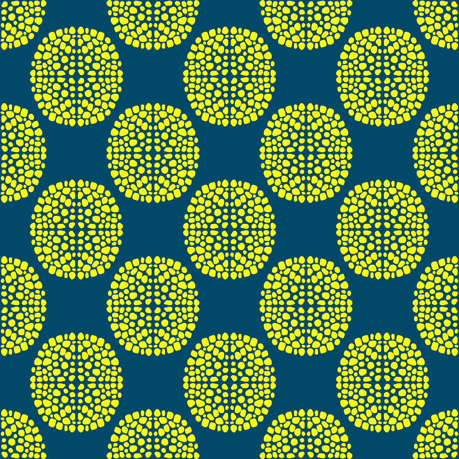
I'll go through the process in a future post, but basically it's a geometric Art Nouveau style abstract. It will be painted with yellow, orange, sky blue and hot pink acrylic (Jo Sonya and Monte Mart Silver Series paints). The thick black lineart was painted with a Posca paint pen. I'm sticking with my love of tiling, seamless, repeating patterns. I actually really liked it at the lineart stage, so in future I might work on some purely black and white pieces too.

Once it's complete I'll have to think of a name. Once again, I'm thinking of giving my abstracts people names rather than vague artsy nonsense. There's just something I like about a painting called Margaret or Georgia or Sam. It makes the painting seem friendly and relatable. After that I'll probably set up an account on Saatchi Art. Maybe I'll put it in my (currently empty) Etsy shop.

Come back soon to see the colours start to go on. I'm already really pleased with how it's turning out and can't wait until it's finished.

nRelate Posts Only