Showing posts with label acrylic paint. Show all posts

Sunday, 3 May 2015

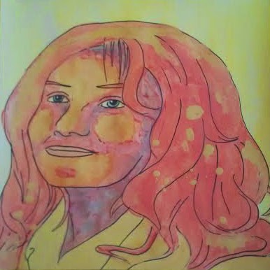
Vortex - Acrylic Paint and Ink Portrait by Renee Dillon

The unexpected arrival of a friend in town made this post a little late, but I'm still hoping to get something up every day in May.


I was going to go with a green background for this one, then get a bit distracted by other colours that were still on my palette and then this happened. Next time I'll experiment with how a single colour background looks. I still think I prefer the person staying in one colour.

Friday, 1 May 2015

The Curly Haired Lady - Acrylic Painted Portrait by Renee Dillon

After the slow blogging month I had in April, I've decided to try posting daily again, like I was doing in January. Unfortunately there isn't another 30 in 30 challenge going on this month, but hopefully I'll still be able to motivate myself. It's all about developing habits, and not letting myself get distracted by other projects.

My theme for this month is simple, graphic, pop art style portraits on 12x12 scrapbooking cardstock. I'm still working on exactly what I want to do with them. I like the simplicity of just the lineart, but I think I like the background to be painted a different colour to add a bit of contrast. In this piece, I decided to add a bit of colour to the lips, eyes and jewelry, to see how I liked it.


For today's portrait, I was inspired by this weeks Color Throwdown colour palette - bright pink, lime green and sky blue. Excuse the dodgy photograph, the colours are much brighter in real life. I'll take a better picture with my camera in the morning. But for now, it's here, and that will do. Not sure what possessed me to do pink for the eyes instead of green, but it is interesting. Experiment, try new things sometimes.


Friday, 6 March 2015

Like Renee Dillon Art on Facebook, Maybe You'll Get to See Some Art

I just added a gadget to the blog so that people can click a button and easily Like my Facebook page for Renee Dillon Art. Though, after reading a few articles about how fan pages on Facebook work, I don't know why I bothered. Facebook makes so much sense as a resource. It's a place a lot of people go every day to see things that entertain them. They can customize the things that come up to be of most interest to them. Or at least they should be. These days, it seems, a vast majority of items on the news feed are ads. And they're not even well targeted ads. They're not even ads that interest me. Isn't that the whole point?

Apparently many of the people who Like your page (with the intention of receiving updates from you) don't see your posts at all, unless you pay Facebook to reach a larger portion of your audience. I could understand advertising to reach new fans, but paying to reach current ones? That's absurd. So now I'm not even sure if I should put that much effort into my Facebook profile. 

Everyone who talks about online marketing stresses the importance of creating an email mailing list - that getting a person's email is the only real true way of capturing them in such a way that you don't lose them when a social network goes under. But that's not the way I engage with the people I want to interact with. I follow people on Youtube, I Like artists on Facebook, I pop in and out of blogs that I've bookmarked. It never occurs to me that I want updates emailed to me about the things I'm interested in or want to see. Because email is full of spam, and I believe that a large proportion of people only have emails these days because you need them to sign up for other websites.

My email inbox contains over 900 unread emails. Most of them are things that I might have genuinely interested in at one point. But the companies trying to sell me something all blend together, the clickbait titles lose their appeal and suddenly it's all just a shade of uninteresting beige advertising that I'm not bothered to even open.

So how are we supposed to find our fans, and retain them? How do we make sure the people that we want to entertain, teach, enlighten and inspire can actually hear us, now and in the future? To be honest, I don't really have a good answer to that. All I can suggest is to grab as many people as you can now, in as many places as possible, and hope that they have enough passion for what you do to try and find you if your method of communication falls apart. It's not ideal, but it's all we have. And even if they don't find you again, just hope that what short period of time you could reach them left some kind of positive impact on their life.

"Turbulence", Acrylic Paint on Paper

Well, now that rant is out of the way, here's another of my new abstracts. This one is called "Turbulence". I'm still not really figuring out this whole abstract art thing, but I have decided to start trying to make my painterly abstracts into mirrored, symmetrical designs like my previous geometric abstracts. I'll see how I like that after I've tried a few. There should be a post about it soon.

Also, despite my earlier rant, if you want to Like Renee Dillon Art on Facebook I really would appreciate it. For all I know, you will get updates. Maybe they'll change the way you can interact with your fans, maybe they already have, I don't know. Either way, click the Like button in the Facebook widget at the side if you're interested. Thanks for looking. :)

Monday, 2 March 2015

New Abstracts - "Cacophony" Painterly Abstract on Paper

Well February is behind us and it looks like I've averaged an hour per day on making art, though not necessarily on what I had expected. This last month I worked a lot on a new kind of abstract art for me. Most of my abstracts in the past have been along the lines of Austin - symmetrical, repeating shapes with bold outlines. This month I've wanted to try my hand at the more conventional style of abstract - paint splattered on a page, with varying textures, colours blending into pleasing combinations, and other mediums creating different types of line and shape. In future, I''d like to be able to blend this type of abstract with my own pattern making style in order to create something new and hopefully interesting.

One thing I've learned about this is that creating a simple looking abstract is, in fact, super hard. There are particular types of marks that I want to make but I'm not really sure how. Sometimes things don't go according to plan and you cover up part of a layer that you intended to keep. It's harder to create a balanced composition when it isn't symmetrical. And for me, it's really very difficult to keep spaces blank as well as busy, complicated areas. Blank spaces look like they need to be filled before they're finished. I need to cut that out, because leaving blanks can lead to a more sophisticated looking image.

I started thinking about this style of loose, painterly abstract because of something I posted during Leslie Saeta's 30 Paintings in 30 Days challenge back in January. One of the artworks I posted, Bethany, seemed to garner quite a bit of attention. That image received more pageviews than any other artwork that I posted to the 30 in 30 blog. I thought this was interesting, for something which had been intended mostly as a place holder, some filler art. I had worked on something else that day which had not succeeded, so plonked my remaining paint on a piece of paper in the hopes of creating a nice background for some future art and called it a day. I hadn't thought it would appear to be interesting to anyone as a standalone piece of art.

I think it's important for this reason not to write off anything you create just because it isn't particularly to your own taste. We all enjoy different things, and your favourite piece of your own art and someone else's might be very different. Since looking into the subject, I've found quite a few abstract artworks that I'm quite enamored with. It's all about finding the examples that appeal to you and figuring out why they appeal more than others.

Unfortunately, I seem to create the best abstracts by accident. Anything I try to do deliberately doesn't seem to come out as visually interesting to me as a random splodge on a piece of scrap paper. My paint palette is fascinating to me, even if the canvas I've spent a couple of hours on isn't. I need to find a way now to trick myself into creating some beautiful art.

"Cacophony", Painterly Abstract in Acrylic Paint on Paper

Tuesday, 17 February 2015

"Amy" - Symmetrical Tiling Abstract in Acrylic Paint

So I've been keeping at my plan to create for an hour a day during February. I'm already a little bit ahead for tomorrow. I find it interesting that sketching and lineart seems to go by so fast, I finish a drawing and I've hardly used up any of my time, yet when I sit down to paint it feels like the time flies by. Maybe I'm focusing harder when I have the paints out because painting is still so strange and different for me. I've been drawing for years, but I'm still quite new to paints, in a way.


Blogger is refusing to justify my text for some reason. It's annoying me to no end.

Paintings in the Works: "Sargent Peanutbutter" the Horse, "Cookie" the Pug, "Fizzy" the Pug, "Lesley" the Cow, Other Misc Art

Sunday, 15 February 2015

"Milo the Red Heeler" - Acrylic Painted Pet Portrait

I follow a Buy Swap and Sell page for pets on Facebook, because I like the cute animals that pop up in my news feed. Mostly it's things like rabbits and birds, but occasionally cute puppies come up and I have to draw them. This one was a red heeler, a different colour variation of a blue heeler. It was actually a pretty difficult colour and texture to emulate in paint, but I like it the way it is anyway.


I love the way the colourful hills and bright blue sky came out. I'll have to do backgrounds like this more often. If you want to buy prints of this image, including items such as throw cushions, greeting cards and phone cases, you can check out my account on Fine Art America.

Tuesday, 10 February 2015

Taking the Plunge

Now that I'm not pushing myself to post everyday to my blog, I find that I'm trying to come up with blog posts that contain more substance. If I only post once or twice a week, I feel like I should be able to come up with something relevant or profound to say to accompany my art or my process. Which is all well and good. But the pressure of creating fewer, better quality blog posts is leading me to avoid posting at all. I've still been painting and drawing this past couple of weeks, of course. But the idea of the deadline that spurred me along is gone. I've been second guessing the things that I want to say and the work-in-progress paintings that I could have posted over the last few days.

I find that this happens a lot with my art. I'm getting better at the concept of just creating something, without worrying whether it will be right or good enough. But when it comes to things like taking print quality images of my finished art, connecting with other artists and bloggers, writing tutorials and useful guest posts to share my art around and developing blog traffic, I put it off. I think there's a part of myself that puts these things off because they make it too real. If I haven't done them yet, I can still consider myself to be at the beginning of my journey. I haven't made the attempt yet, so I can't consider that it hasn't worked.

It's not even the fact that I believe it won't work. I'm almost positive that if I do the things on my to-do list, it will increase traffic to my blog, followers on my Facebook page, sales of my prints and original paintings. But the nagging feeling is still there that it won't happen straight away, or at all. As long as these concepts are in the future, I don't have to deal with them just yet.

Now is the time to let go of that mentality, and move forward. It's time to start really trying to advance my artistic career and see where it takes me. One day I'd really like to be able to work as an artist full time, both teaching art and selling my work. The only way I'll ever get there is to do what any other successful artist has done - plunge in and start working towards it. It won't happen all by itself. There won't ever be a better time than now.

After writing this blog post and psyching myself up, I finally got a decent quality photograph and uploaded my artwork Austin to Fine Art America. Judging by my previous blog posts, I've been meaning to do this since about August last year. Better late than never. You can now buy prints of this image as well as throw cushions, phone cases etc. The original is also still available for sale for $1800.

"Austin", 29x39, Acrylic on Canvas, $1800


Sunday, 1 February 2015

Amy Work in Progress - Symmetrical Tiling Abstract by Renee Dillon

Here is my offering for the 1st of February, my very first hour of the month, as mentioned in my previous post. The first image was actually from January, and doesn't count as time spent in today's hour, but I thought I'd post it anyway. It's a digital draft or colour palette test that I whipped up by colouring over my sketch in Photoshop. I think I should do these colour tests more often, but I think I should stick to them rather than choosing random colours for the digital version and then choosing random colours again for the painting. The digital also tiles at a smaller scale than the original, which makes it harder to see the detail.


As usual, my photo of the painting is a little crooked, so please forgive that. Also, the colours didn't photograph very well. The grayish colour you're seeing is supposed to be metallic purple paint, which looks quite nice in real life. The yellow and green were markers, because I thought I'd go a bit more mixed media with this one and see how it turned out. The markers definitely give a lot more control in small spaces, which I like. Bic Mark-Its also seem to be fairly streak-free in small spaces as well, which I love.

I won't necessarily be trying to post daily in February, but I'll try to stay on the wagon as far as actually creating art goes. Wish me luck!

Total Time Spent Making Art in February: 1 Hour

30 Paintings in 30 Days - Final Thoughts

So, Leslie Saeta's 30 Paintings in 30 Days challenge is finally over for the month of January. I might not have completed 30 finished paintings, as was my original plan, but I did make 22 blog posts, as well as some other art experiments or unfinished pieces that didn't get posted at all. So overall, I'm happy with my effort, and want to compound upon it in future. 

My next rather ambitious goal is to see if I can work on art for at least one hour per day for the whole month of February. That's 28 hours total. I wonder how much I'll actually be able to create in that time. More than if I wasn't pushing myself, that's for sure. My main aim is to set aside a period of time in which I'm not allowed to get distracted by other things. Hopefully it will also encourage me to work faster so I have something to blog about at the end of each session, rather than sit there pondering colour palettes or mediums.

Here are some of the things I didn't get around to posting this month.


Digital Layout of Abstract

Digital Layout of Abstract

Work in Progress of Flower Painting, Need to Add Detail with Pens, Pencils etc.

You might see more of these in future. Or I might get distracted and work on other things. But I thought they belonged here as part of the record of the month anyway.

Wednesday, 28 January 2015

30 Paintings in 30 Days - Day 21 - Wilma WIP 2

Another crazy impromptu addition of colour - this time a lime green. Then finally, bright blue. I thought about adding bright yellow to finish it off, but I quite like the white there. I've already started on the lineart of my next abstract today.


Saturday, 24 January 2015

30 Paintings in 30 Days - Day 19 - Wilma Lineart

Here's the lineart for my tiling abstract, Wilma. I'll be able to start painting it later today. I was annoyed while projecting it onto the paper because the computer went to sleep half way through and when I turned it back on it had moved slightly. I managed to move the paper to line it back up, but trying to move the projector back into the right position was impossible. Lesson learned - next time I'll have the computer play a movie in the background or something so it doesn't think I'm not doing anything with it. Usually I have music or something playing, but today I was listening to the rain outside while drawing.

Thursday, 22 January 2015

30 Paintings in 30 Days - Day 18 - Wilma Work in Progress

Taking a break from the "Goldfish Girl" I have been working on, to start a new tiling abstract. I've missed working on larger abstracts, so it will be nice to paint another one. This one is only 12x12 inches, so not as large as "Austin", but still larger than the 4x4 inch abstracts I tried earlier this month.


I'm thinking of using a colour palette of shades of teal and aqua, bright orange and cream/beige.

Tuesday, 20 January 2015

30 Paintings in 30 Days - Day 17 - Goldfish Girl Work in Progress 2


More of my Goldfish Girl, now with dark hair. I still haven't had much of a chance to work on it lately. The time I've been at home has usually been waiting for someone to arrive, which makes it tricky to pull out the paints when at any moment you may need to pack them up again.

I'm a little behind due to other commitments, but hopefully I'll have another chance to create today.

Sunday, 18 January 2015

30 Paintings in 30 Days - Day 16 - Goldfish Girl Work in Progress 1

I've started my next 12 x 12 portrait. This one is taking a little longer because I had a friend in town at the moment, which cuts down on available painting time. I started wit a layer of orange and blue leftover paint from the previous painting, which I spread liberally over the surface. Some of it mixed to make a surprisingly nice green. I'm pretty picky with greens, usually. I then drew my lineart directly over the painted page with a Bic mark-it pen in Tuxedo Black.


The orange sploshes amongst the blue remind me of goldfish swimming in a pond, hence the title "Goldfish Girl". She also looks a bit like a hipster in those glasses, so she reminds me of the Starbucks logo mermaid.

Not quite sure where to take it from here. I guess wait and see.

Saturday, 17 January 2015

30 Paintings in 30 Days - Day 15 - J K Rowling Final Mixed Media Portrait

I'm guessing this is the second last picture of J K Rowling. All I have left to do is touch up the lineart that has been hidden under layers of paint, then she's done. I'll probably edit this post with the finished artwork rather than make a new post, because six posts of J K Rowling is probably at least 4 posts too many. 


I've painted this portrait on the back of a piece of 12 x 12 scrapbooking paper I bought from GOLO when they were closing down. I wanted to see if scrapbooking paper made a nice surface for painting on, and so far I'm pleased. It held up nicely to layers without too much creasing or buckling, which is good. It's kind of a cardstock thickness. I'll have to check what gsm is written on the paper pad. I might keep an eye out for seasonal paper pads when they're on sale, because I predict I'll be using them for painting again in future. Maybe after next Christmas I'll have finished with the paper I have and it will be the perfect time to buy a new one.


Here's the final piece with reinked lineart, unless I choose to go back and figure out where the rest of the lines in the hair go, Which I might, but that's a job for later. Tomorrow, a new piece of art.

Wednesday, 14 January 2015

30 Paintings in 30 Days - Day 14 - J K Rowling Work in Progress 2

So now J K Rowling has dark hair and looks nothing like J K  Rowling. Admittedly, it wasn't a great likeness to begin with, but now she looks like an entirely different woman. I wanted to cover the splatters with my house paint sample - a British Paints sample pot in the colour Blue Gum Park - then go over that with a lighter blue that would be more similar in value to her actual blonde air. I'm getting into the process of layering different colours to add depth to the final painting. It will be easier once I figure out how all of my different brands and types of acrylic paint react to each other.


PRODUCTS USED (Assorted brands of paints):

30 Paintings in 30 Days - Day 13 - J K Rowling Work in Progress

I've started adding some colour to the J K Rowling sketch I painted yesterday. The splattery texture in the hair is there to cover up some lines I didn't want to keep. I added more spatters to make it look like a uniform pattern rather than one random splodge where the line was. It will mostly be covered up when I add the additional layers of hair colour anyway, but I wanted to make sure the original line wouldn't be visible.


I know I'm technically not posting a new artwork for the 30 Paintings in 30 Days challenge today, but I've decided that I'd rather do part of a larger artwork each day than pump out 30 smaller, less polished artworks for the month. As long as I'm continuing to draw, paint and experiment with different ideas and techniques, and as long as I have something to post each day, I feel like I've accomplished what I intended to anyway.

PRODUCTS USED (Assorted brands of paints):


EDIT: Added these two posts into one because there wasn't that much progress between the two images.


Next step in the J K Rowling portrait. I've added some more shading and highlights to the face to make it look a bit less flat. I've used yellow, orange, red, magenta and blue to create the kind of purpley hue I've ended up with, which I quite like. The hair spatters are looking quite messy now, so hopefully they'll be covered up in the next step.


I'm probably going a bit overboard with the amount of blog posts for this one piece of artwork, but I like documenting the process for future reference. Maybe one day I'll look back at this and think "Good grief, why did I do it like that?" Only time will tell.

PRODUCTS USED (Assorted brands of paints):
 

Tuesday, 13 January 2015

30 Paintings in 30 Days - Day 12 - J K Rowling Sketch

Going back to working on some portraits today. Here's a 12x12 sketch of the author J K Rowling I'm working on at the moment. I'll need to fix the hair a bit in the painting stage, but hopefully that goes alright. I still have to decide what kind of colour scheme I'm using as well. I can't decide what would suit best.   

Monday, 12 January 2015

30 Paintings in 30 Days - Day 11 - Bethany

Just a small, simple abstract today. I played around with some simple techniques involving layering that ended up with me spending a large portion of the day on what turned out to be an unsatisfactory Mark Rothko impersonation. I put this together from unused paint and ended up preferring it to the main artwork I was working on. Such is life.


I've decided to work a little bigger for a while, which may slow down my 30 in 30 progress. Hopefully tomorrow I'll have a portrait to show off that I'm a little more pleased with.

Friday, 9 January 2015

30 Paintings in 30 Days - Day 8 - Elephant

This time, I painted a little elephant. The background was originally orange, then painted over with green. It does provide an interesting depth of colour. I'll have to try that again. Maybe next time I'll underpaint a whole image, then paint over it again in contrasting colours.


nRelate Posts Only