Showing posts with label red. Show all posts

Wednesday, 23 December 2015

Poinsettia Christmas Flower Repeating Pattern

I had so many Christmas designs ready to go, and somehow December has almost crept away from me without posting any of them. This poinsettia design is bright and cheery. It puts me in the mood to draw some more floral designs.


Merry Christmas, everyone! Thanks for looking.

Sunday, 25 October 2015

"Hibiscus and Pansies" - Floral Repeating Pattern

I keep coming back to pansies as one of my go-to flowers to draw. They have a nice shape to them, and they come in some pretty colours. I'd rather like this pattern on a summer dress.

"Hibiscus and Pansies", Digital, September 2015
I made this red hibiscus pattern first, before I drew the pansies. it looks very Hawaiian in red.

"Red Hibiscus", Digital, September 2015

Saturday, 24 October 2015

"Connection" - Digital Mandala

This one reminds me of those construction kits that were a thing when I was a kid. Not sure if they're still around. I think they were called Konnects or something. They were like plastic paddlepop sticks with holes in them. I've named this one "Connection" based on that memory.

"Connection", Digital, October 2015

Tuesday, 13 October 2015

"Dream Catcher" - Digital Mandala

This is the other artwork I'm considering for my first printed handbags. I love the aqua and blue tones in this one, but I still think I'm edging just slightly towards the first. This one makes me think of feathered Native American headdresses or some kind of Mardi Gras decoration. 

"Dream Catcher", Digital Mandala, September 2015


I would have liked to create something new today, but I just spent the morning trying to fix some problems with my wacom tablet. It seems I need to spend an hour fixing things every time I try to create something. But I'm pretty sure I'm close to having all the kinks in my workflow ironed out.

Sunday, 11 October 2015

"Warm Flowers" - Color Throwdown 362 - Digital Repeating Floral Pattern

Today's pattern was made for Color Throwdown's colour palette challenge, but once again I was a day late to submit it to the link list on their website. Either way, I think it's worth posting here anyway. 


I took the inspiration quite literally, as I'd been wanting to draw some more floral patterns lately. This one has orange roses and red pansies, as well as random sprigs of mystery leaves and white dots. 

"Warm Flowers", October 2015


"Warm Flowers Tiling", October 2015

I don't mind how this came out, even though I'm not a fan of brown. This brown is pretty chocolatey, so it's not so bad. It's a pretty warm colour palette overall. This week's colour palette is a lot more pastel and beige, so I'm not sure if I'm going to try something with it. I'll see if I can make it work.

Wednesday, 7 January 2015

30 Paintings in 30 Days - Day 7 - Two Pears with Dots

Experimented a little with using strongly contrasting colours to make shading and texture with this one. The white of the polka dots was done with a sakura gel pen, but I think I might go over it with white paint as well. Next time I try some colourful pears I might try adding even more colours. It's hard to experiment with things that need a lot of layers to dry when you want to upload something every day.


Saturday, 3 January 2015

30 Paintings in 30 Days - Day 3 - White Cat

I'm still getting used to the timing of uploading art to the 30 Paintings in 30 Days challenge. I seem to have a little more than 24 hours to upload each link to Leslie Saeta's blog, which is handy. This might mean the days on my blog posts themselves are a little off, but never mind. 

My offering for Day 3 is another cat portrait, this one a little bigger than the last (though you can't really tell because I upload all of my pictures to my blog at 500 pixels wide). It's proving a little challenging to work at 4 by 4 inches. Small artwork means there aren't a lot of large areas to fill in, but they still require some finesse to cram much detail into a small space.


Again, the colours are a little off because of the photo. I'll have to get the scanner back into my room soon so I can get better quality images more easily.

Monday, 15 December 2014

Jennifer Aniston - Mixed Media Portrait by Renee Dillon


This artwork was a pretty big experiment for me. Even though the image itself is quite simple and straight forward, it was an experiment in applying finished artwork on paper to a canvas. I figure if I can glue a finished artwork on paper to a canvas or other kind of panel and make it look finished even without a frame, I can be more free to work on different sized artwork and experiment without worrying about finding frames to fit. Canvases seem to come in a wider variety of sizes than standard photo frames do, and I can trim a piece of art to fit the canvas as well.

I'd like to be able to complete a few pieces of art before picking my favourites to go on canvases without having to have a huge room full of canvas art that I like enough not to paint over, but not quite enough to hang. This way, I can store the others as flat paper without taking up as much space.

Something I've learned from this experiment - Paint on thicker paper. The paper I painted this image on was quite thin and wrinkled as it dried. I flattened it out fairly well by placing a couple of heavy books on top of it, but it seemed to wrinkle more when I glued it down with matt medium. Air bubbles getting stuck between the paper and the canvas also seemed to be a problem, which I tried to smooth out a bit until I ripped the paper. Thicker paper definitely would have held up better to the moisture. 

The picture above is how it looked before I glued it to the canvas. I might post an update picture of it on the canvas after I've trimmed off the edges. Still need to buy a blade or sharp knife in order to do that.

Sunday, 14 December 2014

Adele - Mixed Media Portrait in Yellow, Red and Teal by Renee Dillon

This portrait of Adele is one of my favourite recent artworks. I've really been enjoying getting used to working with paint and mixed media. This one uses black coloured pencil for the lineart. I like the kind of rustic, expressive look the pencil lines give that I find hard to do with pen. Maybe I should work on making my pen lines more expressive in future. I also love the colour scheme in this one. The contrast between the bright reds and oranges and the cool blues and greens is nice. I'll have to use them together again.


I had a go at using various layers of shadow to the face. Still not perfect, but I'm pleased with it. 

Thursday, 4 December 2014

Patterned Face Experiment 1 and 2

This portrait was an attempt at adding more pattern and colour to my faces. I've seen a few different artists that draw or paint portraits over a patterned background, with the background patterns peaking through the shading and highlights of the face. I like this effect, but it's trickier than I had imagined to pull it off. This first attempt contains too much doodling and the colours are too dark. The lineart gets lost in the chaos and isn't very clear. I think this technique requires larger shapes and brighter colours to work, or at least for the doodles to be obscured under layers of transparent paint.


Since I had liked the sketch so much, I decided not to give up on this particular face. I drew the lineart again on a seperate piece of paper. I like to trace over my original sketch on a new piece of paper to prevent lead pencil smudges on the finished piece and so I still have the original in case I mess up and want to start again (as I did in this case).


This time I went for a cleaner, more simple colouring. The hair is acrylic paint and the face is coloured pencil. I like how this one turned out much better. The background is plain white but I might try cutting out my faces and glueing them on patterned backgrounds in future. This gives me the freedom to splash about creating the background, without worrying about being able to get the face how I want it. When both pieces are created seperately and joined at the end, I can create each without the stress that I might ruin one or the other.

It was interesting to see how two very different looking pieces came from the same lineart. I should try this again in future to see how different techniques and colourways can affect the outcome.

Saturday, 30 August 2014

"Dobby the Whippet" - Colourful, Contemporary Acrylic Paint Pet Portrait

This charming little fellow is a whippet I've called Dobby (because of the big, floppy ears, of course). He's the first in a series of small pet portraits I've been working on. I've been wanting to get more into representational painting since I had some success on Austin. I also wanted to see how much water my sketchbook paper can withstand without warping (turns out, very little, but it can be mushed back into shape with a heavy book, so that's nice). 

"Dobby the Whippet", Pet Portrait, Acrylic Paint on Paper, 6x6


I intended to have a bit more purple when I started, but I quite like the bright primary colours together. It's a bit Fauvist. At least, I think that's what the Fauvist movement was about. I was never that into art history, personally. A quick Google images search shows me that I can't be too far off.

I have a bunch of sketches of different animals - dogs, cats, cows, ducks, bunnies, llamas, etc - so expect more animal portraits in the near future, hopefully as delightfully brightly coloured and cheery as this one. 

Thursday, 20 February 2014

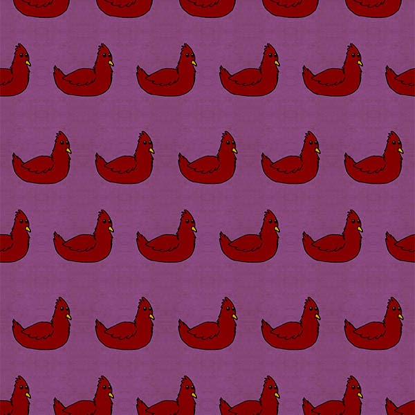
Broody Chickens

My new Easter design, Broody Chickens has just been uploaded in my Etsy store. It comes with a simple polka dot pattern set in matching colours. Not sure if I should keep working on Easter designs or if I should build up a stock of year round patterns. Either way, I think these chickens can be used for other projects at other times of year.


If you want to buy this set, go to Sixth Floor Studio on Etsy. Thanks for looking. :)

Friday, 31 January 2014

Autumn Forest

After some amount of fiddling, I finally have an art space set up. Most importantly, I have the scanner in my room where I can use it at any time without bothering anyone else in the house. It's nice to be able to upload a design and play with it digitally as soon as I'm inspired. 


Today, I've been playing with some tree doodles to make this tiling pattern. I'm still trying to figure out how I want to arrange my scrapbook paper packs in my Etsy shop, but this will definitely be one of them. This image is reduced quality to stop people from saving and printing this version without paying for it. I might offer some free printable images after I have the shop set up.

nRelate Posts Only